I want you to take a moment and think about your everyday life. When you check the weather, do you prefer a visual map of incoming clouds, or would you rather listen to a meteorologist recite temperatures, wind speeds, and precipitation percentages? How about when you track your fitness goals – do you follow the rising and falling line graph on your fitness app, or would you rather sift through pages of your workout stats?
Every day, whether we realize it or not, we’re engaging with data. And more often than not, this data is presented to us through a variety of charts and graphs. They tell us a story, painting a picture that our minds can grasp far easier than a spreadsheet of numbers.
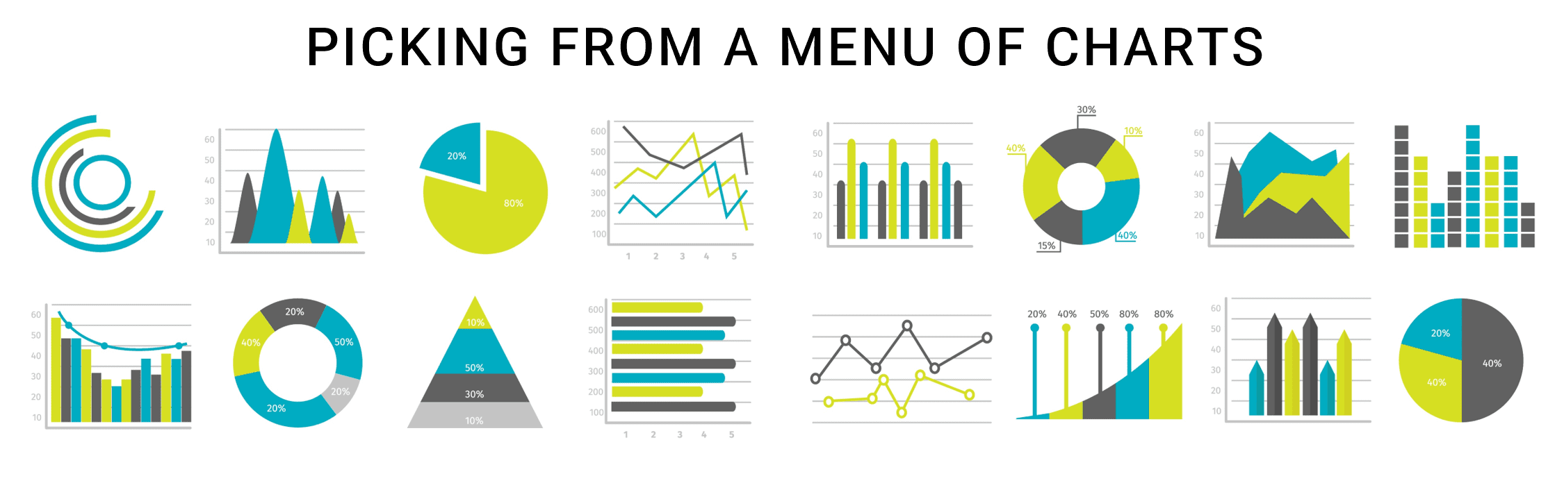
Imagine you’re a chef. You’ve got a kitchen full of ingredients, but to make the best dish, you need to know how to use each one. The same goes for chart types. Each type of chart is like a different ingredient, helping you ‘cook up’ a clear picture of the information you’re dealing with.
Bar charts, pie charts, line graphs, scatter plots, and histograms – these are just a few ‘ingredients’ in your data chef’s kitchen.

The Superpower of Recognizing Chart Types
You’re in the office, and your colleague shows a pie chart in his presentation about the most popular lunch items. If you didn’t know what a pie chart was, you’d be confused. But since you do, you immediately understand that each slice represents a different lunch item, and the bigger the slice, the more popular the item.
Being able to recognize different types of charts like this helps you grasp information accurately. It’s like having a superpower: in one glance, you ‘get’ what the chart is trying to say, and you can even start a cool discussion about it.
For example, you might ask: “Why is pizza such a large slice compared to salad? Are we not promoting healthy food enough?” See, you’ve become a data detective, asking great questions based on your chart knowledge!

Speedy Understanding with Chart Knowledge
When you know your charts, you can understand the information they show more quickly and easily. For example, suppose your basketball coach shows a line graph of your team’s scoring over the season. If you know your charts, you’d quickly understand that the ups and downs show how your team’s performance has changed. You then might begin to think about why the performance changed and turn that knowledge into action. But without that knowledge, you might think it’s a confusing squiggle! Knowing your charts equals understanding data faster and easier.

Confidence and Critique
The more chart types you know, the more confident you’ll feel about making sense of data. Let’s say you’re on a project and need to present your results. If you’re familiar with different charts, you can pick the best one to showcase your findings. It’s like choosing the right outfit for the occasion – you’ll feel confident and prepared.
But there’s another side to this coin. Just as people can use words to mislead, they can use charts the same way. Recognizing different chart types also helps you spot when a chart may be misleading or not telling the whole story. Like a real detective, you’ll know when something doesn’t add up!
Case Study: Enhancing Visualization in Aerospace Engineering
Meet Sarah Reynolds, a skilled corporate professional working as a Project Manager in the Aerospace Engineering division of SkyTech Solutions. Sarah is responsible for overseeing the design and testing of new aircraft components. One day, Sarah was presented with a complex dataset related to the performance of a novel wing design during wind tunnel testing. To effectively communicate the findings with her team and stakeholders, she recognized the importance of selecting the right chart types and conveying the information clearly.
Sarah understood that different chart types serve distinct purposes, and her familiarity with a variety of charts would be crucial in effectively presenting the results of the wind tunnel testing. She began by analyzing the dataset and identifying key insights that needed to be conveyed:
- Comparative Analysis: Sarah wanted to compare the lift and drag coefficients of the new wing design against the existing design. She knew that a side-by-side comparison could help highlight the performance differences, making a bar chart or a grouped column chart ideal for this purpose.
- Trends and Patterns: Sarah also needed to showcase the fluctuation of lift and drag coefficients at different angles of attack. She recognized that a line chart would be effective in illustrating how these coefficients changed as the angle of attack varied.
- Distribution and Spread: Understanding the distribution of airflow pressure on the wing’s surface was vital. Sarah realized that a heatmap or a contour plot could visually represent pressure distribution, providing insights into potential aerodynamic challenges.
- Correlation Analysis: Sarah wanted to explore the relationship between the wing’s surface roughness and drag coefficient. She decided that a scatter plot could effectively visualize this correlation, helping her team identify any trends or anomalies.
- Overall Performance: To provide a comprehensive overview of the new wing design’s performance, Sarah planned to use a radar chart. This chart would allow her to display multiple performance metrics (such as lift, drag, stability, and efficiency) on a single visual, aiding in holistic evaluation.
Recognizing the importance of selecting the right chart types, Sarah engaged her team in a discussion. She encouraged input from her colleagues, as they brought diverse perspectives from their areas of expertise. Through collaborative brainstorming, they refined the visualization strategy and chose the most suitable chart types for each aspect of the wind tunnel testing data.
As Sarah prepared her presentation, she ensured that each chart was well-labeled, with clear titles and axis labels. She also added annotations and callouts to highlight specific data points of interest. During the presentation, Sarah seamlessly transitioned between different chart types, making it easier for her team and stakeholders to grasp complex information and draw meaningful conclusions.
In this case, Sarah’s familiarity with various chart types proved instrumental in effectively communicating intricate aerospace engineering data. Her thoughtful selection and skillful presentation of charts facilitated a deeper understanding of the wind tunnel testing results among her team and stakeholders. By recognizing the role of chart types in conveying information, Sarah showcased her ability to bridge technical insights with effective communication, a crucial skill in the field of aerospace engineering.