Data analysis is like detective work, where you search for clues hidden in numbers and patterns. One of the first steps in this exciting journey is exploring distributions. Let’s dive into what this means and how it can be done, especially if you’re a high school student at an 8th-grade reading level.
What Does It Mean to Explore Distributions?
Starting with frequency tables
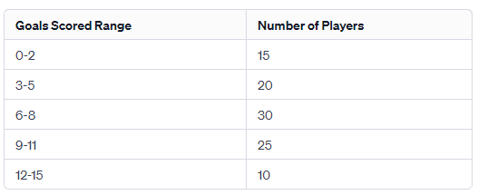
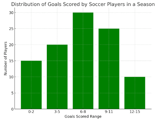
Before you get into the nitty-gritty of data distribution, start with something simple: frequency tables. Imagine we’re looking at a soccer league and analyzing the number of goals scored by players in a season. A frequency table will show the number of goals scored by players. This is a great way to get a first look at your data and spot any interesting trends or unusual patterns.
Collect and organize data
Next, gather all the data you need. This could mean doing surveys, setting up experiments, or just observing something and taking notes. Once you’ve got your data, put it in order so it’s easier to work with. You can use a spreadsheet or special software to help with this.
Visualize the data
A picture is worth a thousand numbers! Create graphs like histograms, box plots, or density plots to see what your data looks like. These graphs can tell you a lot about your data, like where most of the values are bunched up (the central tendency), how spread out they are (the spread), and if they lean more one way than another (the skewness).
Calculate descriptive statistics
This is where you crunch some numbers to get a better understanding of your data. Find out the average (mean), the middle value (median), and the most common value (mode). Also, look at how spread out your data is by calculating the range, interquartile range, standard deviation, and variance. These calculations can tell you a lot about the shape and characteristics of your data.
- Mean (Average) Goals Scored: The average number of goals scored by a player in the season is approximately 6.9.
- Variance: The variance of goals scored is about 13.67. This number gives us an idea of how much the number of goals scored by each player varies from the average.
- Standard Deviation: The standard deviation is approximately 3.70. This value tells us, on average, how much individual goal-scoring performances differ from the mean number of goals scored.
Identify the type of distribution
Now, combine what you’ve seen in your graphs with the numbers you’ve calculated. This can help you figure out what kind of distribution your data might have. For example, if your data looks like a bell curve and is evenly spread out, it might be a normal distribution. If it’s about counting successes in a set number of tries, like getting heads in coin flips, it might be a binomial distribution.
Conduct further analysis
Once you know what type of distribution you’re dealing with, you can do more detailed analysis. This might include testing hypotheses (like checking if one player’s average score is really different from another’s), building models to predict future trends, or other statistical methods that fit your data’s distribution. The kind of analysis you do depends on what you want to find out from your study.
Exploring distributions is a crucial step in understanding what your data is trying to tell you. It’s like piecing together a puzzle – first, you lay out all your pieces (collect and organize data), then you start to see how they fit together (visualize and calculate statistics), and finally, you get a clear picture of what it all means (identify the distribution and conduct further analysis). With these steps, you’re well on your way to becoming a data analysis pro!
Case Study: Did the Math Test Get Leaked?
 A high school teacher, Mr. Anderson, is investigating potential cheating in a recent exam. He suspects that some students may have had access to the exam questions beforehand. To assess this, he employs statistical analysis, focusing on the distribution and patterns of the students’ answers.
Mr. Anderson collects the answer sheets of all students. He notes the frequency of each answer choice for each question, organizing this data into frequency tables. He pays particular attention to questions where the majority of students chose the same answer, especially if it’s an uncommon or difficult question.
To better understand answer patterns, Mr. Anderson creates visualizations. He uses bar charts to represent the frequency of chosen answers for each question. He also employs heat maps to visualize patterns, such as clusters of students who have identical or nearly identical sets of answers, which could suggest copying or shared information.
Mr. Anderson calculates descriptive statistics for the answers, such as the mean, median, and mode for each question. He also looks at the variance and standard deviation to understand the spread and variability in the answers. He compares these statistics with the expected performance based on previous exams and class performance, looking for anomalies such as unusually high scores on typically hard questions.
He analyzes the distribution of the answers. Under normal circumstances, he expects a certain degree of variability in student responses, especially on more difficult questions. If he finds that the distribution of answers is unusually narrow (i.e., many students selecting the same answers), particularly on questions that typically have a wide spread of responses, it may suggest that the students had prior access to the exam questions.