A bar chart is a chart that shows the frequency of values in a dataset using bars. The height of each bar represents the frequency of values in that category.
So, how are the heights of the bars in a bar chart related to values in a frequency table? Well, a frequency table is a way of organizing and summarizing data. It shows how many times each value appears in a dataset.
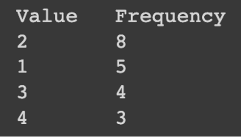
When you create a bar chart from a frequency table, you use the frequency counts to determine the height of each bar. The bar chart shows the same information as the frequency table, but in a visual way that makes it easier to see patterns in the data.
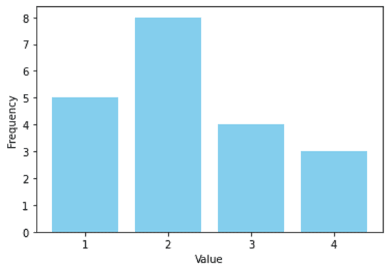
For example, if you have a frequency table that shows how many times each type of fruit was sold at a grocery store, you can use that information to create a bar chart. The height of each bar in the bar chart will represent the frequency of that type of fruit, so the tallest bar will represent the fruit that was sold the most.
So, the heights of the bars in a bar chart are directly related to the values in a frequency table. The bar chart is a visual representation of the frequency table, and the heights of the bars show how many times each value appears in the dataset.