In this tutorial, we’re going to learn how to create charts and graphs in a spreadsheet. This skill is very useful, especially when you want to visually represent your data, making it easier to understand and analyze. Let’s dive in!
Imagine you own a small bakery and want to track your monthly sales. You’ve already entered the data into a spreadsheet. Now, let’s create a chart to visualize the sales trend!
1. First, open your spreadsheet application.
We’ll be using Microsoft Excel or Google Sheets for this example, but the process is similar in other applications.
2. Select the data range:
- Click on the first cell of your data (e.g., A1, which might have the month names).
- Drag your cursor to the last cell that contains data (e.g., B12, where you have the sales figure for the last month).
3. Insert a chart:
- In Excel: Click on the “Insert” tab and the “Recommended Charts” button. Excel will suggest some chart types based on your data.
- In Google Sheets: Click on the “Insert” menu, then choose “Chart.” Google Sheets will also recommend some chart types.
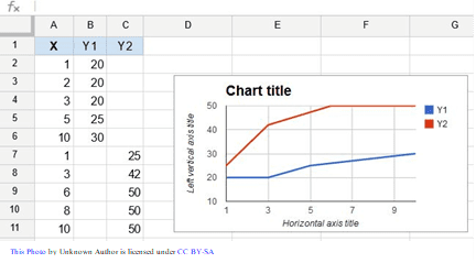
4. Choose a chart type:
- For our bakery example, a “Column” or “Line” chart would work well to display the sales trend over time.
- Click on the desired chart type and hit “OK” in Excel or click on it in Google Sheets.
5. Customize your chart:
- Click on the chart to select it. You’ll see some new options for customizing your chart.
- Play around with the “Chart Elements” (Excel) or “Customize” tab (Google Sheets) to adjust the chart title, axis labels, legend, and more. Make it look just the way you want!
6. Move and resize your chart:
- To move the chart, click and drag the chart to the desired position on the spreadsheet.
- To resize the chart, click and drag the edges or corners until it’s the perfect size.
And there you have it! You’ve created a beautiful chart visually representing your bakery’s sales trend. Depending on your data and needs, you can use this same process to create other types of charts and graphs, like pie charts, bar charts, or scatter plots.
Remember, practice makes perfect, so keep experimenting with different chart types and customization options to become a spreadsheet wizard in no time!