Let’s take a moment to imagine. Picture yourself getting ready to embark on an epic road trip across this diverse and beautiful country of ours.🚗 You’ve packed your bags, the car is fueled,⛽ your playlist is ready, 🎵 and the excitement is mounting. But wait, what’s the one crucial thing you can’t forget? That’s right, your roadmap or GPS system. 🧭
Have you ever stopped to consider what’s behind these maps? 🗺️
These maps are specific chart types that show geospatial information. These are the diagrams, the graphics, and the visualizations that not only tell us where we are but also show us patterns, trends, and relationships. They can answer questions like ‘How crowded is my favorite beach during different times of the year?’ or ‘What’s the COVID-19 infection rate in different neighborhoods of my city?’.
 Cartogram
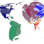 Cartogram
Let’s start with cartograms. Imagine we’re looking at a map of our school, but instead of just showing the rooms, it shows how many people are in each room. The library, filled with kids studying for tests, might look gigantic, while the empty storage room might look super tiny. That’s a cartogram – a map where the size of something shows more than just physical size, but also another factor like population.
Important facts about cartograms:
- A cartogram is a map in which some variable (like population or GDP) is substituted for land area.
- The size of a region is scaled according to the variable of interest rather than its actual geographical area.
- Cartograms can offer a powerful alternative perspective on data where a raw geographical area might not be relevant.
Be aware that while cartograms can make patterns easier to see, they can also distort geographical reality and make some areas harder to recognize.
Choropleth
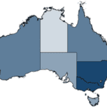 Choropleth
Next up is the choropleth. Imagine a map that uses different colors to show how much snow fell in different neighborhoods after a big storm. Your neighborhood might be colored light blue for a little snow, while another neighborhood is dark blue for a lot of snow. That’s a choropleth, a map that uses colors or patterns to show different amounts of something.
Important facts about choropleths:
- A choropleth map displays divided geographical areas that are colored or patterned according to the value of a variable.
- Choropleths are great for visualizing the geographic distribution of data across different regions.
- They can sometimes create a false impression of abrupt change at the borders between areas.
Watch out for the area size effect; larger areas might appear more significant than they are. Also, ensure the data is normalized (like per capita) to avoid misleading representations.
Isopleth
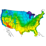 Isopleth
Ever seen those weather maps on TV that show how hot or cold it is in different places with lines? Those are called isopleths. They connect places with equal values – for example, everywhere that’s 85 degrees gets connected by one line, everywhere that’s 80 degrees by another, and so on.
Important facts about isopleths:
- Isopleth maps use lines to connect points of equal value, often used for weather data (like temperature or rainfall).
- Isopleths show smooth transitions between regions, unlike the abrupt transitions shown in choropleths.
- They are excellent for representing continuous data over space.
Reading an isopleth map requires understanding the concept of interpolation, as the map makes assumptions about values between known data points.
Flow Map
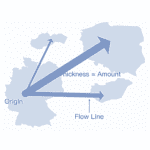 Flow Map
Now, let’s imagine you and your friends all live in different places but go to the same school. If we made a map showing routes from everyone’s house to school, that would be a flow map. It’s like drawing a bunch of arrows on a map to show movement from one place to another.
Important facts about flow maps:
- A flow map shows the movement of objects from one location to another, like the number of people in a migration, the amount of goods being traded, etc.
- Flow maps provide a unique visualization of movement or change over geographical space, which most other map types don’t.
Watch out, flow maps can be complex and may require careful study to interpret correctly. It’s also important to note that lines in a flow map represent movement, not borders or paths.
Map with Markers
 Map with Markers
This one is simple. Imagine a map of our town with a dot for each pizza place. That’s a map with markers! But remember, if there are too many pizza places (can there really be too many?), it could get a little cluttered.
Important facts about maps with markers:
- This type of map uses markers placed at specific geographical points to represent data related to those locations.
- Marker maps are a simple and direct way to visualize geographical data.
- They can become cluttered if there are many data points.
If markers overlap, it can become difficult to accurately perceive the number or distribution of data points. It’s also important to note that the size or color of markers might represent additional variables.
Map with Proportional Symbols (Bubble Map)
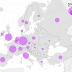 Map with Proportional Symbols (Bubble Map)
If we took that pizza place map and made each dot bigger or smaller depending on how many pizzas they sell each day, it would be a bubble map. The size of the circle (or bubble) shows the size of the data.
Important facts about bubble maps:
- A bubble map uses circles of different sizes to represent data at specific geographical locations.
- The size of the circle corresponds to the magnitude of the data it represents.
- Proportional symbols can represent more complexity than simple markers.
- Bubble maps might also be harder to interpret accurately.
Watch out, as the perceived size of circles can sometimes be misleading, and overlapping circles can obscure data.
Voronoi Diagram
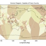 Voronoi Diagram
Lastly, imagine a map that shows who lives closest to each pizza place in town. Everyone living closer to ‘Tony’s Pizzeria’ than any other pizzeria would be in one region, everyone closer to ‘Papa John’s’ in another, and so on. That’s a Voronoi diagram.
Important facts about Voronoi diagrams:
- A Voronoi diagram divides the map into regions based on the distance to points.
- Each point gets a region where all locations in that region are closer to that point than to any other point.
- Voronoi diagrams provide a unique way of visualizing distance-based relationships that other chart types can’t.
Reading a Voronoi diagram requires understanding the concept of distance-based space partitioning. Also, note that real-world geographical constraints might make some Voronoi regions unrealistic.