In this article, we will explore the concept of chart highlighting, understand its importance in chart design, and delve into best practices that ensure our highlighted elements shine with clarity and purpose.
Understanding Chart Highlighting
Chart highlighting is a powerful design technique that directs the viewer’s attention toward important elements within a chart. By using visual cues, we can make specific data points, categories, or patterns stand out, guiding the viewer’s focus and facilitating understanding. Through highlighting, we illuminate the insights hidden within the chart’s complexity.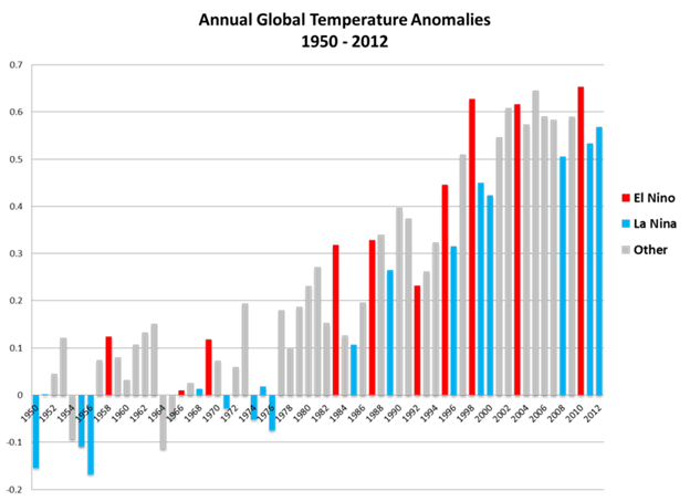
Design Techniques for Chart Highlighting
We can employ various design techniques to highlight chart elements effectively. Here are some key strategies:
- Preattentive Attributes: When we encounter visual stimuli, our brains automatically and unconsciously process certain attributes, such as color, shape, size, or orientation, without requiring conscious effort. These preattentive attributes possess distinct characteristics that make them highly effective in capturing our attention and engaging our iconic memory. Additionally, we can draw the viewer’s gaze toward specific elements.
- Color hue refers to the distinct shades within a color spectrum. Using different hues, we can create visual contrast and emphasize specific chart elements. For instance, using a bright red color to highlight a particular data point in a scatterplot can draw immediate attention.
- Color intensity involves varying the saturation or brightness of a color. By adjusting the intensity, we can highlight or de-emphasize elements within a chart. For instance, using a lighter shade of blue to downplay less significant bars in a bar chart while using a darker shade to highlight a specific bar can effectively guide the viewer’s attention. Let’s consider a timeline chart that displays different events over a period of time. To highlight the duration of each event, you could use a lighter shade of color at the start of the event and gradually transition to a darker shade as the event progresses.
- Length can be used to highlight elements within a chart. For example, using a longer bar to represent a higher value in a bar chart helps emphasize its significance compared to shorter bars.
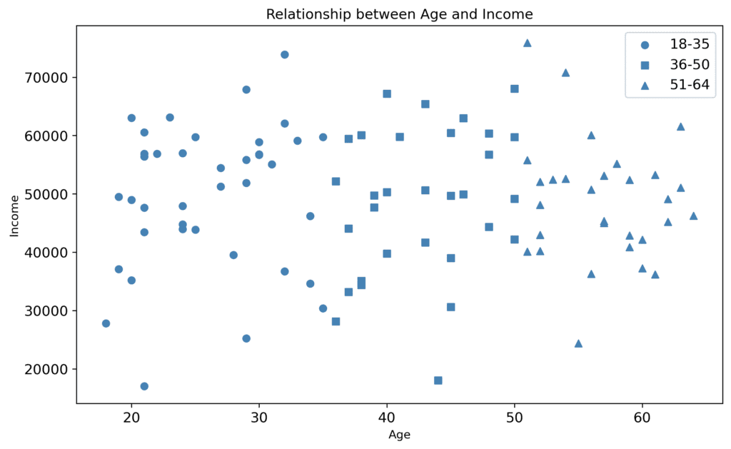
- Shape of chart elements can serve as a distinctive attribute for highlighting. Employing different easily identifiable forms for specific data points or data markers within a chart can draw attention to important observations or outliers. A reader can distinguish between different categories of data by having different shapes on them in the visualization. For example, a different shape can be assigned to each region in a scatter plot representing profit and sales by region.
- Size plays a crucial role in chart highlighting. Increasing the size of specific elements, such as data points or labels, can make them stand out prominently, guiding the viewer’s attention toward essential information.
- Additional marks, such as data labels, arrows, icons, callouts, connectors or lines, borders and frames, and annotations or markers, can enhance the highlighting effect in a chart. Selectively adding marks to specific elements or data points can reinforce their importance and aid comprehension.
- Orientation of chart elements can be leveraged for highlighting. Rotating or angling certain elements, such as labels or data bars, can create visual contrast and draw attention to specific information.
Example: Fonts play a crucial role in chart design by serving as preattentive attributes that aid in conveying information effectively. The choice of typeface sets the overall tone and style of the chart. Different typefaces evoke different emotions and can convey specific meanings. The weight and size of the font can help differentiate between different levels of information hierarchy. The contrast in font styles can be employed to distinguish various categories or data points in a chart.
- Designing for tone: Highlighting can convey a chart’s desired tone or mood. Using color, typography, shapes, and layout strategically can evoke positive, negative, lighthearted, serious, or alert sentiments. For example, use warm colors for positive data trends or bold and contrasting typography for urgent information.
![]()
Designing Chart Highlighting: Pro Tips
- Indicate importance: Highlighting a select few elements in a chart helps establish a clear visual hierarchy. Visual hierarchy is the arrangement of elements in a way that guides viewers’ attention and indicates the relative importance of different components. When too many elements are highlighted, the visual hierarchy becomes blurred, making it challenging for viewers to distinguish between primary and secondary information. Highlight elements that deserve the viewer’s attention. Focus on critical information or key insights that align with the chart’s purpose and message. Avoid highlighting elements arbitrarily, as this may confuse or mislead viewers.
- Semantically consistent highlighting: Ensure that the chosen highlighting techniques align with the meaning conveyed by the highlighted elements. For instance, use colors that intuitively represent positive or negative values or align the shape of the highlighting mark with the intended interpretation. For example, imagine a bar chart depicting the attendance at different types of schools. If the bars representing religious-affiliated schools and boarding schools are highlighted in red, it conveys a consistent visual language where red indicates private education. Such consistency aids viewers in quickly grasping the highlighted elements and their significance within the chart.
- Limit highlighted elements: Be mindful of the number of elements you choose to highlight.
- Over-highlighting can overwhelm the viewer and dilute the impact of important information. By consciously limiting the number of highlighted elements, we ensure that viewers can easily discern and absorb the most important information in the chart, facilitating a more streamlined and meaningful understanding.
- Ensure contrast: When colors appear too similar or blend together, it becomes arduous to distinguish between different chart elements. This hampers readability and comprehension and may lead to misinterpretation of the data. By selecting visually distinct colors that provide ample contrast, we can overcome this problem and ensure that the chart is easily decipherable.
- One of the primary reasons for ensuring sufficient color contrast in chart design is to make the information easily readable for everyone. Consider that individuals may have varying visual capabilities or color vision deficiencies. By employing colors with distinct contrast, we enable individuals with visual impairments or difficulties to distinguish between different elements in the chart. This inclusivity ensures that everyone can access and comprehend the information presented.
- Layer preattentive attributes: Consider combining multiple preattentive attributes to increase the impact of highlighting. For example, using a larger size and a distinct color hue together will create a stronger visual emphasis on the highlighted element.
- Beware of bias: Highlighting chart elements has a powerful impact on viewer perception. It creates a bias towards the highlighted elements, directing attention and influencing interpretation. When specific elements are highlighted, viewers naturally allocate more cognitive resources to process and remember them. Consequently, the highlighted elements become more salient and memorable, shaping the overall understanding of the chart’s message. Be mindful of this impact and strategically use highlighting to guide viewers’ focus and reinforce key insights.