Let’s take a moment to consider the importance of time. Time governs everything around us, doesn’t it? From the rise and fall of civilizations to the change of seasons, the growth of your favorite tree in your backyard, or the progress of your very own life – everything is in a constant dance with time. And understanding how things change over time is essential to understanding our world.
What if I told you that your life is surrounded by charts that show change over time and play a significant role in how you understand and interact with the world? The weather forecast you checked this morning, the news about stock market trends you read, the fitness progress you track on your smartphone, or the population growth stats you came across in a documentary – all of these are examples of change over time, visualized using charts.
 Area Chart
 Area Chart
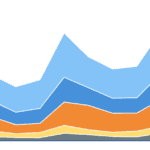
Think about your phone battery. When you wake up, it’s 100%, but as you use it throughout the day, the charge drops. This is exactly what an area chart can show us! An area chart is like watching the water level rise or fall in a glass – it shows how much of something you have at different points in time.
Important facts about area charts:
- An area chart shows the quantity of one or more variables over time, represented as areas beneath a line
- They make it easier to comprehend the magnitude of change and trends over time
- Area charts are similar to line charts but emphasize the magnitude of values by filling the area below the line
- Stacked area charts can show the contribution of different groups to a total over time, similar to stacked bar charts
Just remember, when using an area chart, the area under the line is important, but don’t mistake it for volume – it doesn’t show how ‘full’ something is, but rather the total over time. Additionally, in stacked area charts, the area on top is affected by the one underneath, which can sometimes distort the perception of change. Also, the area can sometimes imply a sense of volume, which might be misleading.
Bump Chart
 Bump Chart
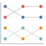
Imagine your favorite basketball players are in a race, and you want to see who’s in the lead after each game. That’s a job for the bump chart! The bump chart is like a race, showing who’s in the lead, who’s fallen behind, and who’s caught up over time. It’s like a leaderboard that changes every moment.
Important facts about bump charts:
- Bump charts are used to rank categories over time, representing each category with a line.
- They’re great for observing changes in rank over time.
- Unlike line or area charts, bump charts highlight the rank rather than the absolute or relative value.
- They are useful when the position of a category relative to others is important.
But it can get a little crowded if too many players join the race, so keep the participants to a minimum for a clear view! When bump charts become cluttered, they are hard to read, and they may hide the magnitude of changes because they focus on rank.
Line Chart
 Line Chart
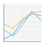
- A line chart displays the change in one or more variables over time by connecting data points with a line
- They help highlight trends and patterns over time
- Line charts are among the most straightforward and commonly used types of chart for showing time series data
- Unlike bar or area charts, they focus on the trend rather than the individual values
Slope Graph
 Slope Graph
- Slope graphs compare the change in a variable between two points in time.
- Each category is represented by a line that connects these two points.
- Slope graphs are simpler than line charts and are excellent for highlighting relative change between two-time points.
- They don’t show trends over multiple time points like line or area charts.