Imagine you’re a budding musician trying to learn how to play a complex song on your instrument. The sheet music in front of you seems like a maze of notes, rhythms, and symbols. It’s as if it’s written in a foreign language, and the musical notation looks like abstract art rather than helpful instructions. Without a clear guide on how to play the piece, you might find yourself frustrated and struggling to create beautiful music.
This feeling of confusion is similar to what many people experience when they encounter a complex chart or graph without any explanation. Just like trying to decipher the sheet music on your own, interpreting the data visualization can be a daunting task without proper guidance.
The Mystery of Chart Context
When we talk about the ‘context’ of a chart, we’re talking about the story behind it. Every chart tells a tale, and it’s up to us to find out what that story is. Just like a detective wouldn’t solve a case without understanding the ‘who,’ ‘what,’ ‘when,’ ‘where,’ and ‘why,’ we need to ask the same questions about our charts.
Consider a basic bar chart illustrating the quantity of gourmet sandwiches sold over a corporate quarter. In this scenario, the ‘who’ corresponds to our company’s catering department responsible for orchestrating the promotion. The ‘what’ signifies the gourmet sandwiches themselves, and the ‘when’ pertains to specific time frames within the quarter. As for the ‘where,’ it’s within our corporate premises, while the ‘why’ likely revolves around a fundraising initiative to support a charitable cause. These particulars, akin to the chart’s header, subtext, citation, and annotations, serve as vital cues to fathom the chart’s backdrop and significance within our corporate environment.
Here are key considerations when thinking about chart context:
- Chart context refers to the overall environment or conditions in which a chart is created and should be interpreted.
- It includes factors such as the source of data, the purpose of the chart, the intended audience, and the circumstances under which the data was collected.
- The title is one of the most essential parts of any chart, as it serves to describe the main theme or subject of the data being presented.
- A subtitle, though not always present, provides further context or clarification for your chart.
- The source and footnotes provide essential information on where the data came from and any additional details or explanations that make the chart more comprehensive.
- Chart context is crucial for a correct and comprehensive understanding of a chart.
- Without understanding the context, a reader may misinterpret the information or miss out on critical nuances.
- The source of data is a crucial part of the chart context as it determines the reliability and validity of the data presented.
- Recognizing the source helps identify possible biases, errors, or potential manipulation in the data.
- The purpose of the chart also forms part of its context.
- Knowing why the chart was created helps in understanding the message or insight that the chart is intended to convey.
- The circumstances under which the data was collected can greatly affect its interpretation
Interpreting chart context using scaffolding
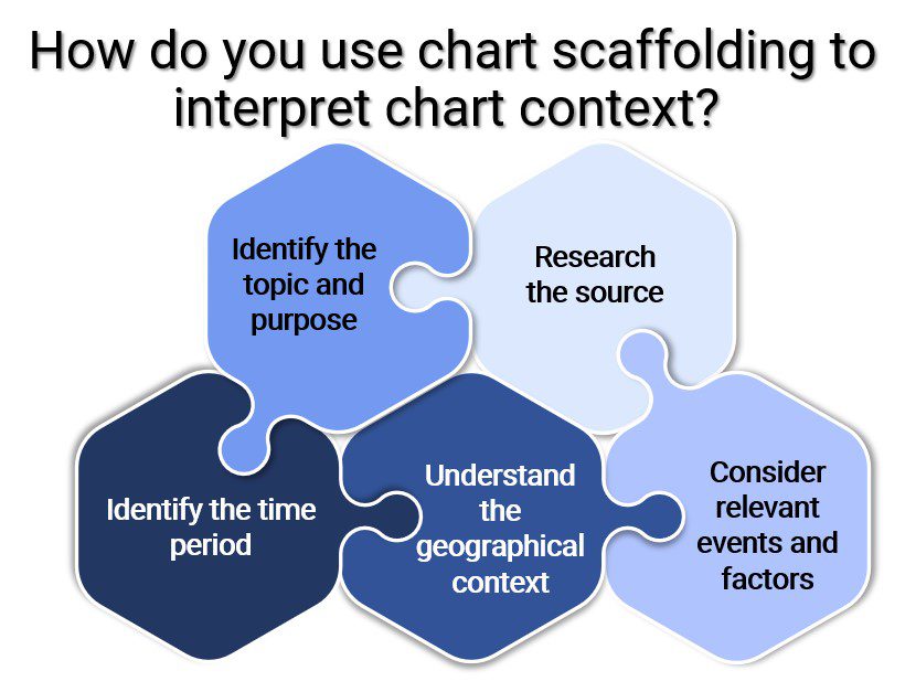
- Identify the topic and purpose of the chart
- Research the source
- Identify the time period
- Understand the geographical context
- Consider relevant events or factors

Decoding Charts: Pitfalls and Pro Tips
- Don’t rush. Take your time to understand all parts of a chart. Misinterpretation often happens when we overlook key details such as units, scale, or time frame.
- Be a detective. Check the source of the chart and look for any bias. Charts can be manipulated to present data in a way that supports a particular argument or point of view.
- Stay curious. If something doesn’t make sense, investigate further. Look for additional sources of information that can help clarify or expand on what the chart is showing.
- Verify your clues. Compare the chart data with information from other sources. This can help confirm the accuracy of the data and provide additional context.
- Always consider the big picture. How does the chart fit into what you already know? How might external factors have influenced the data?
Chart Scaffolding: A Recipe for Restaurant Insights
In the dynamic realm of corporate hospitality, where culinary artistry and business acumen blend harmoniously, Alex Turner, a seasoned restaurant analyst at Gastronomix Group, embarked on an insightful journey to harness the power of chart scaffolding in unraveling the intricacies of restaurant performance data visualizations. Armed with a passion for gastronomy and a knack for deciphering data, Alex ventured into the world of chart interpretation, poised to distill meaningful insights from the culinary chaos.
Gastronomix Group, a leading player in the restaurant industry, was facing a conundrum. The executive team needed to make informed decisions about menu adjustments and marketing strategies, relying on a sea of performance data. However, deciphering these charts proved challenging without a clear understanding of their contextual nuances. Alex recognized that chart scaffolding – the backdrop against which data was presented – was the key to unlocking actionable insights.
Diving headfirst into the restaurant’s data trove, Alex found a rich array of charts, graphs, and visualizations portraying customer feedback, sales trends, and menu popularity. This mosaic of data provided the foundation for Alex’s exploration into the world of chart scaffolding, revealing the crucial role that elements like titles, labels, and scales played in shaping the narrative.
One bar chart depicted the popularity of different dishes over a fiscal quarter. As Alex dissected the chart, the choice of y-axis scale stood out – each dish’s popularity was highlighted against a clear scale, allowing for immediate comparison. Additionally, the chart’s title and subtitle provided context by indicating the timeframe and source of data. This scaffolding enabled the executive team to quickly discern which dishes were customer favorites and where potential adjustments were needed.
Further down the data rabbit hole, Alex encountered a line graph detailing customer satisfaction ratings over different days of the week. The use of color coding and a well-labeled x-axis enabled easy identification of trends. Alex realized that this carefully crafted scaffolding not only made the data easier to comprehend but also facilitated the identification of weekdays with lower satisfaction ratings, prompting a focus on improvement strategies.
Melding these insights into a compelling narrative, Alex presented his findings to Gastronomix Group’s management. His analysis underscored the pivotal role of chart scaffolding in deciphering complex restaurant data. By emphasizing the importance of clear titles, labels, and scales, Alex’s exploration showcased how these seemingly minor elements can guide decision-making processes and illuminate actionable strategies.
Alex’s mastery of chart scaffolding principles reverberated throughout Gastronomix Group. The organization embraced a data-driven approach that prioritized effective data presentation, fostering collaboration between culinary experts and decision-makers. Inspired by Alex’s narrative, the team refined their data visualization strategies, enhancing their ability to tailor menus and marketing efforts according to customer preferences and trends.
In the end, Alex Turner’s journey into the world of chart scaffolding not only illuminated the path to interpreting restaurant performance data but also highlighted the transformative potential of data visualization in revolutionizing corporate hospitality.