Imagine you’re a budding musician trying to learn how to play a complex song on your instrument.🎶 The sheet music in front of you seems like a maze of notes, rhythms, and symbols. 🎼 It’s as if it’s written in a foreign language, and the musical notation looks like abstract art rather than helpful instructions. Without a clear guide on how to play the piece, you might find yourself frustrated and struggling 🤯 to create beautiful music.
This feeling of confusion is similar to what many people experience when they encounter a complex chart or graph without any explanation. Just like trying to decipher the sheet music on your own, interpreting the data visualization can be a daunting task without proper guidance.
Just as a good music teacher helps you learn to play a challenging song, chart scaffolding helps you navigate through intricate charts and graphs 📊 so you can confidently find the melody and harmony hidden within the data. It provides a framework to decode and interpret the information so you can harmonize with the data and uncover its true message, like playing the perfect tune on your instrument.🎸
The Mystery of Chart Context
When we talk about the ‘context’ of a chart, we’re talking about the story behind it. Every chart tells a tale, and it’s up to us to find out what that story is. Just like a detective wouldn’t solve a case without understanding the ‘who,’ ‘what,’ ‘when,’ ‘where,’ and ‘why,’ we need to ask the same questions about our charts.
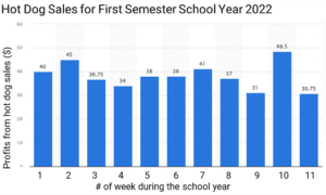
For instance, let’s take a simple bar chart showing the number of hot dogs sold throughout a school semester. The ‘who’ could be the school’s student council, who organized the event. The ‘what’ is the hot dogs, and the ‘when’ is during specific time periods. The ‘where’ is the school, and the ‘why’ might be to raise funds for a field trip. These details, like the title, subtitle, source, and footnotes of a chart, help us understand its context.
Understanding the chart context is like knowing the rules of a game before playing it. Without it, we might get confused or misunderstand the game or, in this case, the chart.
Here Are Key Considerations When Thinking About Chart Context:
- Chart context refers to the overall environment or conditions in which a chart is created and should be interpreted.
- It includes factors such as the source of data, the purpose of the chart, the intended audience, and the circumstances under which the data was collected.
- The title is one of the most essential parts of any chart, as it serves to describe the main theme or subject of the data being presented.
- A subtitle, though not always present, provides further context or clarification for your chart.
- The source and footnotes provide essential information on where the data came from and any additional details or explanations that make the chart more comprehensive.
- Chart context is crucial for a correct and comprehensive understanding of a chart.
- Without understanding the context, a reader may misinterpret the information or miss out on critical nuances.
- The source of data is a crucial part of the chart context as it determines the reliability and validity of the data presented.
- Recognizing the source helps identify possible biases, errors, or potential manipulation in the data.
- The purpose of the chart also forms part of its context.
- Knowing why the chart was created helps in understanding the message or insight that the chart is intended to convey.
- The circumstances under which the data was collected can greatly affect its interpretation.
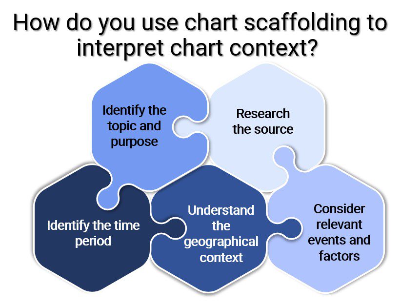
Interpreting Chart Context Using Scaffolding
Remember our hot dog sale chart? Let’s use chart scaffolding to interpret it.
- Identify the topic and purpose of the chart
First, we look at the title, which tells us about the hot dog sales. The title often provides a summary of what the chart is about. It usually indicates the variables being compared or the phenomenon being illustrated.
- Research the source
Then, we check the source or the footnote, which tells us that the student council created this chart. Using the footnotes helps to understand where the chart comes from. What organization or individual created it? What is their expertise, agenda, or potential bias? Is the data source reputable and reliable? Understanding these elements can help give context to the chart and its data.
- Identify the time period
We see the time period on the X-axis that shows us the data is from the most recent game. Using the chart axes provides answers to questions like: Is it current or historical data? How might events or conditions during this time period have influenced the data? Also, consider if the chart represents a snapshot in time or a trend over a specific period.
- Understand the geographical context
If the chart had different locations, like the number of hot dogs sold at different school events, we’d want to think about why those locations might affect sales. Thinking about the implications of geographical context leads to important questions such as: Is there a reason the data might be different in these places? For example, economic, cultural, political, or environmental factors could influence the data.
- Consider relevant events or factors
If there were other factors, like a popular band performing at the game, we’d want to consider that, too. Look at the axis labels to identify the chart variables. If the chart shows economic data, consider relevant economic events. If it’s health data, were there any significant health or societal events that could impact it?

Decoding Charts: Pitfalls and Pro Tips
So, we now know that charts have context, and we can use scaffolding to understand them better. But beware! There can be traps. Sometimes, we might not notice important details in a chart, like if the sales are in dollars or the number of hot dogs. Also, charts can be tricky. They might be drawn in a way to make something look better or worse than it really is.
Here are some tips for being a top chart detective:
- Don’t rush. Take your time to understand all parts of a chart. Misinterpretation often happens when we overlook key details such as units, scale, or time frame.
- Be a detective. Check the source of the chart and look for any bias. Charts can be manipulated to present data in a way that supports a particular argument or point of view.
- Stay curious. If something doesn’t make sense, investigate further. Look for additional sources of information that can help clarify or expand on what the chart is showing.
- Verify your clues. Compare the chart data with information from other sources. This can help confirm the accuracy of the data and provide additional context.
- Always consider the big picture. How does the chart fit into what you already know? How might external factors have influenced the data?
Slam Dunk Stats: Sasha’s Game-Changing Use of Chart Scaffolding
 Once there was a high school sophomore and fervent basketball fan named Sasha, who decided to help her school’s basketball team using her newly learned skill – chart scaffolding. Her school, Westville High, was home to the Mighty Wolverines, a talented group of athletes. Despite their talent, they struggled to maintain a winning streak. Sasha believed the answer to their challenge was hidden in the basketball game statistics.
One sunny afternoon, Sasha sat down with a chart titled “Wolverines Scoring Patterns – Season Average.” The chart, provided by the school’s statistics department, presented a visual summary of the team’s scoring averages per quarter for the current season.
Sasha began her chart scaffolding adventure. She first looked at the chart title, which told her that the graph represented the team’s average scores per quarter. The ‘Scoring Patterns’ part indicated a comparison of the team’s performance over the four quarters of the game. Her first question, ‘What is the chart about?’ was quickly answered.
Next, she examined the source of the data. It was provided by the school’s statistics department, a reliable source she knew had access to all the team’s game records. They had no reason to manipulate the data or present any bias. Sasha could, therefore, trust the data’s validity.
The X-axis of the chart represented the four quarters of a basketball game, while the Y-axis showed the average points scored. She realized the data was about the current season, giving her recent and relevant insights into the team’s performance.
As Sasha studied the bar graph, she noted a distinct pattern – the team’s performance consistently dipped in the third quarter. She wondered, “Why the third quarter?” Remembering her chart scaffolding lessons, Sasha decided to consider any relevant factors.
With a bit of digging, she discovered that the third quarter was immediately after the halftime break. Sasha hypothesized that the break might be disrupting the team’s momentum. She checked with the coach and found out that the team usually rested during halftime, with little activity.
Armed with her chart interpretation and the additional context she had gathered, Sasha suggested to the coach that the team use a part of the halftime for light practice to keep their momentum up. The coach appreciated her insightful suggestion and decided to implement it.
In the games that followed, the Wolverines’ third-quarter performance improved, and they began to win more consistently. Sasha’s adept use of chart scaffolding, coupled with her love for basketball, had helped her school’s team turn their season around. From then on, Sasha was known as the Chart Wizard, the student who could decode any chart and make a real-world impact. And all it took was the magical process of chart scaffolding!