In this article, we will explore the concept of visual grouping, its significance in chart design, and the design techniques that help us visually link related chart elements. By understanding and applying these principles, we can create charts that communicate information effectively and facilitate a deeper understanding of the data.
Understanding Visual Grouping
Visual perception refers to how our visual system organizes and groups visual stimuli based on specific principles and cues. It involves the automatic and rapid processing of visual information, which allows us to perceive meaningful patterns, relationships, and structures in the presented data. Visual grouping is a design strategy involving linking related chart elements to convey their association or relationship visually. By applying principles derived from Gestalt psychology, we can create visual cues that guide viewers in perceiving the connections and patterns within the data. Visual grouping helps organize and structure information, enhancing comprehension and facilitating data-driven insights.
Design Techniques to Visually Link Chart Elements
To visually link related chart elements, we can employ various design techniques inspired by the Gestalt Principles of Visual Processing:
The following Gestalt Principles explain how we naturally perceive and group visual elements. Understanding these principles helps us create meaningful connections within charts.
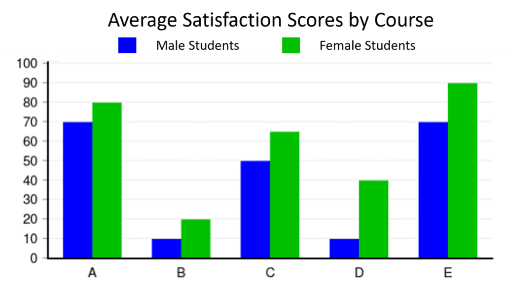
- Similarity: By using similar colors, shapes, or styles, we can group related elements in a chart. For example, coloring related data points in a scatterplot with the same hue allows viewers to perceive their association at a glance.
- Proximity: Placing chart elements close to each other indicates their relationship. For instance, positioning data labels near the corresponding data series helps viewers easily associate labels with specific data points or categories.
- Closure: Removing unnecessary boundaries or borders within a chart encourages viewers to perceive the enclosed elements as a single group. Closure can be leveraged to aid viewers in perceiving patterns, trends, and relationships by helping connect related data points. This technique reduces clutter and promotes a seamless perception of related data.
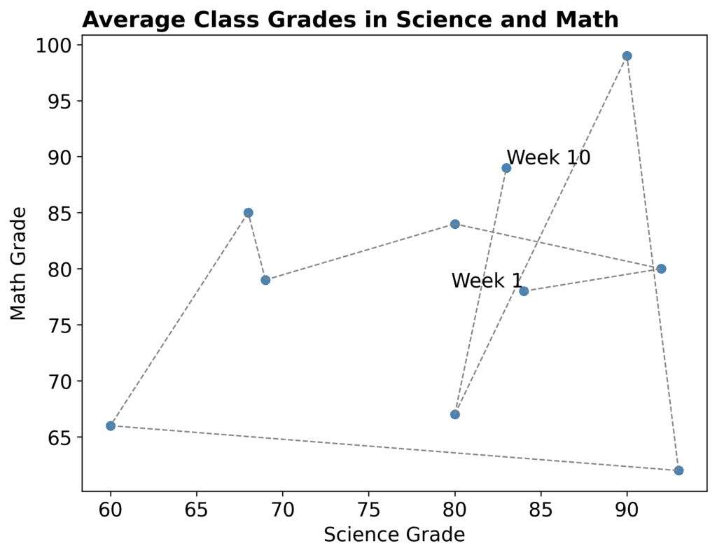
- Connectedness: Adding lines or connectors to link related data points or data series strengthens their visual connection. This technique is particularly useful in scatterplots or line charts where viewers can discern trends or relationships between connected elements.
- Continuity: Utilizing continuous lines, curves, or gradients helps viewers perceive a smooth and uninterrupted data flow. This technique facilitates understanding the chart’s continuous patterns, trends, or transitions.
- Figure-ground: When you want to create a visual separation between categories to highlight their differences, the figure-ground principle relates to the perception of elements as either the “figure” (the main object of focus) or the “ground” (the background against which the figure stands out). Applying this principle can help draw attention to specific categories or data points by visually separating them from the background.
Example: Applying color to demonstrate Gestalt principles
- Using contrasting colors for the figure and the background can make the figure stand out and create a distinct separation between the two.
- Applying the same color to related elements in a chart can indicate their similarity and create groupings or categories.
- Assigning the same color to elements that are physically close to each other in a chart enhances the perception of their relationship and proximity.
- Using color to fill in the gaps or complete the missing parts of a shape can enhance the perception of closure.
- Color can help demonstrate continuity by using a consistent color scheme or gradient for elements that share a continuous relationship.
- Using contrasting colors for different data points or categories can make them visually distinct and aid in their differentiation.
Best Practices for Visual Grouping
To ensure effective visual grouping in chart design, consider the following best practices:
- Consider the strength of association: When applying visual grouping techniques, prioritize proximity over similarity, similarity over closure, and closure over the figure-ground relationship. Proximity, or placing related elements close together, tends to strongly impact viewers’ perception of groupings.
- Balance and simplicity: Maintain a balanced composition by grouping related elements while avoiding overcrowding or excessive visual complexity. Simplicity in design enhances clarity and facilitates easier interpretation of the chart.
- Consistency and coherence: Apply consistent visual grouping techniques throughout the chart to maintain coherence and aid viewers in recognizing and interpreting the relationships between chart elements. Inconsistencies can lead to confusion and hinder understanding.
- Contextual considerations: Adapt visual grouping techniques to the specific context and purpose of the chart. Understand the audience’s background, knowledge, and expectations to optimize the visual hierarchy and grouping strategies accordingly.