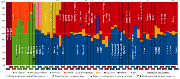
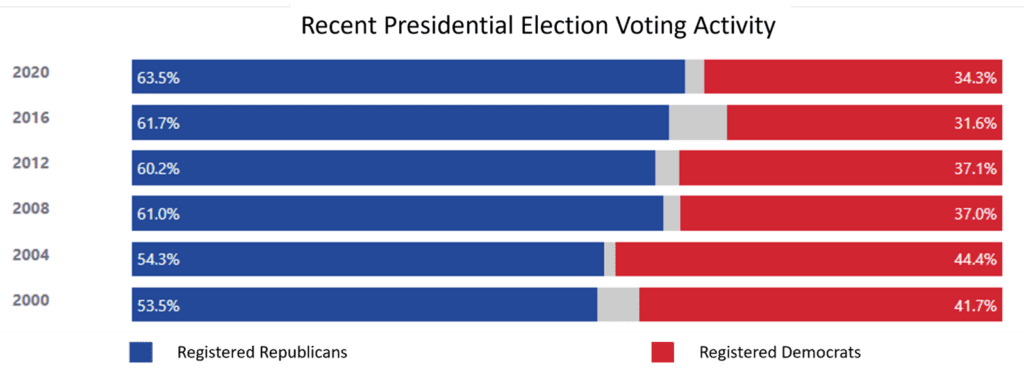
The following article discusses how the way we see affects our interpretation of charts and why it is of utmost importance when designing effective visual representations. Here are some key concepts to keep in mind when designing charts:
Harnessing the Power of Visual Communication
Charts are powerful tools for communication, enabling us to convey complex information concisely and easily understandable. One key reason for their effectiveness lies in how humans process visual information. Our brains are wired to process visuals much faster than textual information. Visuals are appealing and engage our cognitive abilities, allowing us to absorb information more readily. However, complex charts with cluttered visuals can overwhelm viewers, hindering their ability to understand the presented information.
By streamlining the design, reducing unnecessary elements, and maximizing the data-to-ink ratio, we can alleviate cognitive load and promote clarity, enabling viewers to focus on the core message of the chart.
Chart Design and Meaning Interpretation
The design of a chart significantly impacts the meaning that viewers draw from it. Considering how humans process visual information is vital in creating charts that are intuitive, clear, and accessible. Employing design elements that align with our natural perceptual tendencies ensures that charts are readily understandable. Clear labels, concise titles, and logical data organization all contribute to an intuitive chart layout, enabling viewers to grasp information effortlessly. By employing techniques such as highlighting, grouping, and the strategic use of colors and fonts, designers can emphasize key insights and guide the viewer’s attention. This attentional guidance ensures that important information stands out, leading to a more impactful and memorable communication of data. Here are a few key considerations:
- Highlighting: Through highlighting, we can emphasize important parts of a chart. By employing techniques such as color contrast, size variations, or font emphasis, we direct the viewer’s attention to the essential elements, making them stand out.
- Grouping: Visual grouping techniques, such as proximity, similarity, or enclosure, help establish associations between related elements. By visually grouping data points or categories, we assist viewers in understanding relationships and patterns within the chart.
- Colors and fonts: Colors and fonts play a vital role in chart design, conveying tone, emotion, and information hierarchy. Selecting appropriate colors and fonts enhances clarity and aids in better comprehension of the chart’s message.
Layout and Formatting Influence Information Flow
The layout and formatting of chart elements impact the way viewers navigate and process information. Organizing data points logically and employing proper spacing and alignment contribute to a smooth flow of information. By carefully arranging chart elements, we guide viewers through the data, ensuring that the intended message is conveyed effectively.
Consideration for Diverse Viewers
Viewers of charts vary in their technical expertise, cultural backgrounds, and visual capabilities. It is essential to design charts that cater to a broad audience, considering their diverse needs. Using clear language, avoiding jargon, and ensuring that visual elements are universally understandable contribute to inclusive chart design.
The Role of Chart Attractiveness
The attractiveness of a chart plays a significant role in capturing and retaining the viewer’s attention. We can engage viewers and make the chart more memorable by employing aesthetically pleasing design elements, such as well-chosen colors, balanced composition, and appropriate visuals. A visually appealing chart enhances audience attention, ensuring that the information is effectively conveyed.
- First impressions matter: An aesthetically pleasing chart serves as an invitation, enticing viewers to explore its contents further. Just like a book cover can intrigue us to delve into its pages, an attractive chart grabs attention and encourages a deeper connection.
- Keeping the viewer engaged: When charts are visually appealing, viewers are likelier to stay engaged, focusing their attention on the presented data and insights. This sustained interest ensures that the chart’s message is effectively conveyed and comprehended.
- Evoking curiosity and fascination: Colors, typography, imagery, and overall design choices can create an ambiance that stirs curiosity and fascination. By appealing to the viewers’ emotions, charts can inspire a deeper connection and a genuine desire to explore the information further.
- Facilitating information retention: Thoughtful choices in color schemes, legible fonts, and clear data representation enhance the clarity and accessibility of the information. As a result, viewers can grasp and retain key insights more effectively.
- Leaving a lasting impression: When we encounter visually striking visuals, our brains are more likely to retain and recall the information they convey. By designing charts that are visually memorable, we increase the likelihood that the message conveyed through the chart will stay with the viewer long after they have moved on.
Understanding the impact of visual perception on chart design is crucial for effective communication. By recognizing how humans process visual information, considering the role of highlighting, grouping, layout, and formatting, catering to diverse viewers and ensuring chart attractiveness, we can design charts that resonate with their intended audience.