I want you to take a moment to think back to the last decision you had to make. It could have been as simple as choosing between two types of coffee this morning, or as complex as deciding the best candidate for a job promotion at work. Now, picture in your mind the criteria you considered to make that choice. In our daily lives, we’re constantly comparing options, aren’t we? It’s how we decide where to eat, what to wear, which movie to watch, or even who to hire.
In essence, what you’re doing is not that different from what a data analyst or a statistician does. Just as we weigh up factors to make a decision, they compile data, organize it, and compare different metrics. And a key tool they use to visualize these comparisons and make them digestible is charts. Today, we’re going to delve into that world, the world of charts, more specifically, chart types that show comparisons.
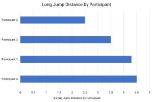
Bar Chart
First up is the Bar Chart. Imagine you and your friends decide to hold a mini-Olympics, and you have a few events – sprinting, long jump, and shot put. A bar chart can help compare the scores of each player in each event.
Important facts about bar charts:
- Bar charts are ideal for comparing multiple categories.
- Each bar represents a category, and its length represents the value of that category, making it easy to visually compare different categories.
- Bar charts are straightforward and easy to read.
- The simplicity of bar charts makes them widely used for displaying comparisons.
Pay attention to the scale on the y-axis. An inconsistent or inappropriate scale can distort the comparison. Also, note that bar charts don’t show a trend over time well.
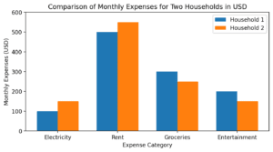
Grouped Plots
Imagine you are given a project where you have to evaluate the difference of household expenses for two families that live in different cities. The household expenses are broken down by categories such as groceries, utilities, rent, and entertainment. Grouped plots, also known as grouped bar charts, support our understanding of information by visually organizing and comparing data within different categories or groups. By placing related data points side by side in the chart, we can easily compare the values and identify patterns or trends between the groups. This allows us to make meaningful comparisons and draw insights from the data, helping us understand the relationships and variations between different categories more effectively.
Important facts about grouped plots:
- Grouped plots are great for comparing multiple variables for different groups.
- They show variations within each group and can give a sense of distribution within each category.
- Grouped plots provide more detailed information compared to simpler charts like bar charts.
- They can show multiple levels of comparison, but they can also be more complex to read.
Watch out as grouped plots can become cluttered and difficult to interpret if there are too many categories or if the differences between categories are subtle.
 Cleveland Dot Plot
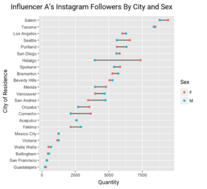 Cleveland Dot Plot
 It’s like our bar chart, but instead of bars, it uses dots. It’s super helpful when comparing lots of categories. Let’s say you and your friends start a book club, and you all read at different speeds. A Cleveland dot plot could show how quickly each person finishes each book. But be careful! This plot may seem like an alien language to your little brother or grandma, so it’s not always the best choice for everyone.
Important facts about Cleveland dot plots:
- Cleveland dot plots allow for precise comparisons between different categories by using dots to represent values.
- They’re particularly effective when comparing many categories or values that are close together.
- They are more accurate and easier to interpret when comparing many categories or similar values, compared to bar charts or pie charts.
Be careful, as they can be harder to interpret for a general audience who is not accustomed to this chart type. The axis scales must also be carefully chosen to avoid skewing the representation of the data.
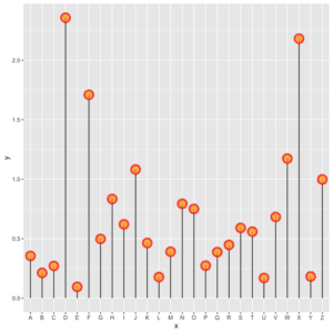
Lollipop Chart
The Lollipop Chart is as fun as it sounds. Imagine you’re comparing heights in your basketball team, and you want to make the difference between the shortest and tallest players stand out. The Lollipop chart, with its circles at the end of the stick, makes this difference pop.
Important facts about lollipop charts:
- Lollipop charts are similar to bar charts, but they use a circle at the end of a long line (the ‘stick’) to represent the value.
- They’re useful for comparing different categories and can emphasize the difference in values more clearly than bar charts.
- They offer a more visually appealing and cleaner design compared to bar charts, while still providing a similar level of information.
Like bar charts, be careful with the scale on the y-axis. Also, the ‘lollipop’ design can sometimes distract from the data, so ensure the design does not overshadow the data’s message.
 Pictogram
 Pictogram
 A Pictogram is a chart with style. Instead of bars or lines, we use pictures. For instance, you are reading about the casualties involved with a historical military conflict, and you want to know the breakdown of deaths and injuries. A pictogram could use soldier icons. But remember, keep the icons proportional for correct interpretation.
Important facts about pictograms:
- Pictograms use icons to represent values, and the number of icons corresponds to the value of the data.
- They’re effective for comparing simple data sets, especially where it’s helpful to visualize quantities in a concrete, relatable way.
- Pictograms are more intuitive and engaging than many other charts, but they’re less precise and are not suitable for complex or large datasets.
Beware, pictograms can be misleading if the icon size is not consistent or proportional to the values it represents. They also struggle with representing fractions or decimals.
 Radar Chart
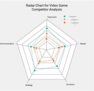 Radar Chart
 Lastly, meet the Radar Chart. It’s like a spider web, each line representing a different category. Imagine you’re rating a video game opponents based on different characteristics. The closer to the edge each category reaches, the higher the score. But, if we put too many categories on it, it’ll start looking like a 200-legged spider. Yikes!
Important facts about radar charts:
- Radar charts are effective for comparing multiple variables for different categories.
- They’re particularly useful when there is a cyclical relationship or when comparing an observed value to an ideal or reference value.
- They can display multivariate data in a compact format, but they can be harder to read than simpler charts, especially for audiences unfamiliar with this chart type.
Radar charts can be misleading if the axes are not properly scaled or if there are too many variables. They also assume a circular relationship among variables, which might not be relevant.
Remember, each chart has its own strengths and weaknesses, just like us. By understanding them, we’ll become sharper and smarter in reading data and making decisions.