Visual narratives are crucial in data storytelling and communication because they make complex information more easily understandable, engaging, and memorable. With vast amounts of data generated daily, extracting meaningful insights and communicating them effectively becomes essential. This is where data visualization comes in, allowing us to tell powerful data stories and share insights through engaging visuals. This tutorial will explore key aspects of visual narratives and some best practices to create impactful data stories.
The Story Framework
A story framework provides a structure for the narrative, ensuring a main goal and helping to organize the information logically and efficiently. This can help ensure that the story flows smoothly and that the reader understands the key points. Providing a framework for the story can help ensure the message is focused and clear. The framework will also allow a breakdown of the story into manageable pieces. This can help the reader to understand the key takeaways from the data better and to retain the information more effectively.
Key components of the framework include:
- Introduction: The introduction sets the stage, providing background information, context, and an overview of the topic or issue being explored.
- Characters: Visual narratives often involve characters the audience can relate to or connect with. In a data narrative, there are typically data points, variables, or entities that represent the focus of the narrative.
- Plot or sequence of events: The plot or sequence of events outlines the flow and structure of the visual narrative. It presents a series of interconnected scenes, actions, or developments that unfold over time. The plot should have a clear beginning, middle, and end to create a sense of progression and resolution.
Simplicity and Clarity
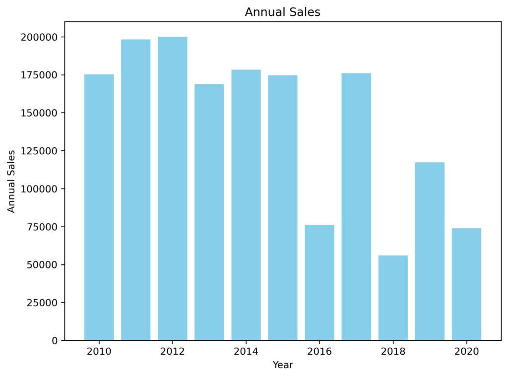
One of the most vital principles of good data storytelling is to keep the visual narrative simple and easy to understand. To ensure simplicity, focusing on the core message and highlighting relevant data is important, eliminating any visual clutter or unnecessary information.
For example, consider a bar chart (Figure 1.1) that shows a company’s annual sales over the last ten years. A well-designed chart should highlight the growth trend with distinct colors or labels while avoiding information overload.
Use the Right Chart Type
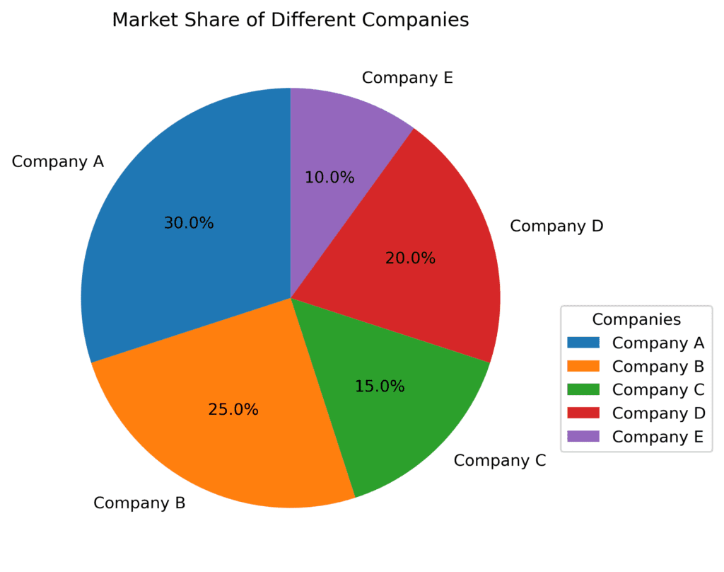
Choosing the right chart type is crucial as it can significantly impact the ease of understanding the data story. For example, use a bar chart to compare categorical data, a line chart to represent trends over time, and a pie chart to depict proportions or percentages.
A real-world example is the representation of market share data for different companies. A pie chart (Figure 2.1) is an excellent choice for visualizing the percentage share of each company in the market.
Use of Color and Visuals
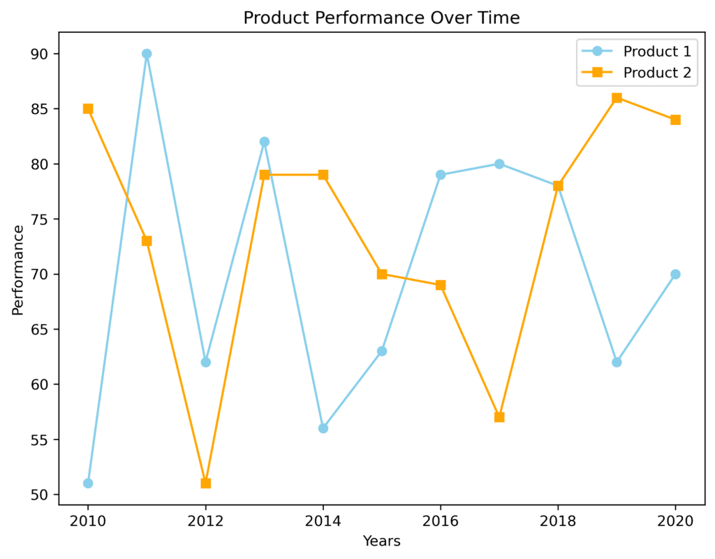
Colors and visuals play a significant role in data storytelling, helping attract attention, convey emotions, and distinguish between data points. Be mindful of color selection and ensure the colors are accessible and distinguishable for all viewers.
For instance, if we compare the performance of two products over time, it’s essential to use contrasting colors for each product’s line in the line chart (Figure 3.1).
Annotations and Labeling
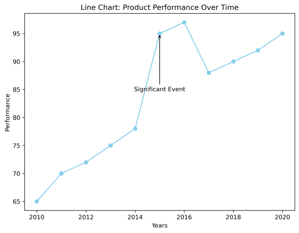
Annotations and labeling help provide context and make the visual narrative easier to understand. To explain trends or emphasize specific events, you can use arrows, callouts, or labels directly within the visual.
For instance, consider a line chart that showcases a company’s stock prices over time (Figure 4.1). If there was a significant event, like a new product launch, which resulted in an increase in stock price, an annotation can bring attention to that point.
Provide Context
Always provide context to your visual narratives so your audience understands the data better. This context can be provided in the form of titles, subtitles, or annotations, which help make the story more relatable and meaningful.
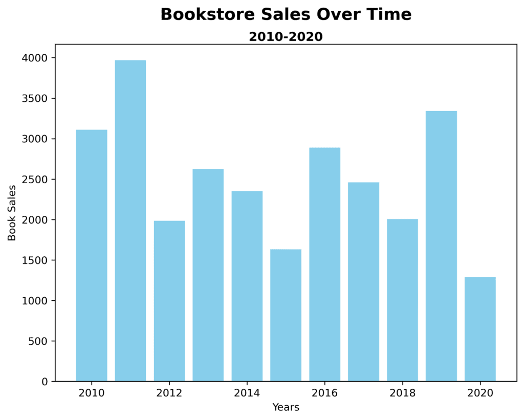
For example, in a bar chart displaying the number of books sold by a bookstore over the years (Figure 5.1), having a title indicating the bookstore’s name and the years represented would provide much-needed context to the audience.
In conclusion, creating effective visual narratives in data storytelling and communication can be achieved by ensuring simplicity, choosing the right chart type, using color and visual elements wisely, providing proper annotations and labels, and giving context. By following these best practices, you can create engaging and impactful data stories that convey important insights to your audience.