Welcome to the captivating world of data visualization in Python, where numbers transform into visual stories that captivate and enlighten. In this journey, we’ll explore the art of creating informative charts and graphs, turning raw data into vibrant narratives that reveal hidden patterns, trends, and insights. With an array of powerful charting libraries at your fingertips, you’ll learn to wield Python’s creative tools, painting a visual canvas that not only showcases data but also guides decision-making. Join us as we embark on this visual voyage, uncovering the nuances of each library and mastering the techniques to tell compelling data tales.
Common Libraries for Creating Charts in Python
Embarking on a journey to visualize data in Python opens a world of possibilities, where charts and graphs bring insights to life. To harness this power, familiarize yourself with the realm of charting libraries that Python offers, each holding a unique set of tools to shape your data into compelling visual narratives.
- ‘Matplotlib’: A Universe of Plotting Versatility. At the heart of Python’s visualization galaxy lies ‘Matplotlib’ – a celestial tool for crafting an array of plots and figures. Whether you’re conjuring line plots, scatter plots, bar plots, histograms, or error charts, ‘Matplotlib’s’ robust toolkit lets you weave intricate visual tales. Its high customizability empowers you to design plots tailored to your data’s story.
- ‘Seaborn’: Elevating Statistics through Visual Aesthetics. A companion to ”Matplotlib’, ‘Seaborn’ traverses the cosmos of statistical data visualization. Elevating your visual narratives with themed aesthetics and high-level interfaces, ‘Seaborn’ simplifies intricate visualizations. Perfect for unveiling statistical relationships, this library transforms complex data into engaging insights, making your visualizations an artful exploration of information.
- ‘Pandas’: A Hybrid of Data Manipulation and Visualization. As you journey through data exploration with ‘Pandas,’ you’ll discover its dual nature – a data manipulation powerhouse and a gateway to basic plotting capabilities. Built on ‘Matplotlib’s’ foundation, ‘Pandas’ offers inbuilt plotting functions that seamlessly blend into your data preprocessing workflows. Streamlining visualization within your data pipelines, ‘Pandas’ becomes your ally for swift data insights.
- ‘Plotly’: A Dynamic Symphony of Interactive Plots. ‘Plotly’ stands apart, conducting interactive symphonies of data visualization. Contrasting ‘Matplotlib’s’ static plots, ‘Plotly’s’ charts respond to your whims within web browsers. Manipulating and exploring data stories through interactive charts, ‘Plotly’ becomes an orchestra of insight, perfect for crafting dashboards and sharing data-driven narratives online.
- ‘Bokeh’: Crafting Interactive Visual Art for the Web. In the realm of interactive visual artistry, ‘Bokeh’ reigns supreme. Wielding the power to create web-ready plots with a touch of interactivity, ‘Bokeh’s’ tools render directly to HTML and JavaScript. Craft captivating plots, ready to grace web applications and dashboards, guiding users through immersive data experiences.
- ‘Altair’: The Elegance of Declarative Visualization. Step into the realm of declarative visual exploration with ‘Altair.’ Simplicity and ease of use define this library, making it an ideal starting point. Whether you’re new to visualization or seeking to escape the intricacies of extensive customization, ‘Altair’s’ elegance transforms your data into eloquent visual narratives.
Create Charts with ‘Matplotlib’ in Python
To create charts using ‘Matplotlib,’ follow these steps. However, keep in mind that for complex visualizations, ‘Matplotlib’s’ customization options might require more effort compared to some other visualization libraries.
- Installing ‘Matplotlib’:
Usepipto install ‘Matplotlib’:pip install matplotlib - Import Necessary Libraries:
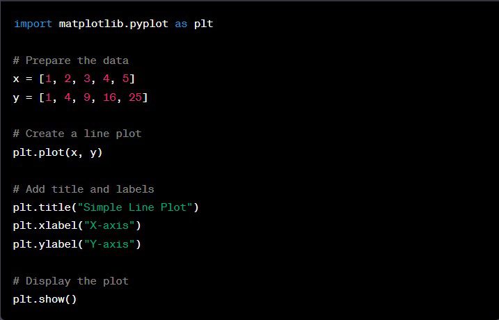
Begin your artistic journey by importing the essential library:import matplotlib.pyplot as plt - Prepare the Data:
Your canvas starts with data. Begin with a simple list or array, like:x = [1, 2, 3, 4, 5] ; y = [1, 4, 9, 16, 25] - Choose the Type of Plot:
– Line Plot:plt.plot(x, y)
– Bar Chart:plt.bar(bars, heights)
– Histogram:plt.hist(data, bins=6)
– Scatter Plot:plt.scatter(x, y)
– Pie Chart:plt.pie(sizes, labels=labels, autopct='%1.1f%%') - Customizing the Chart:
Add the finishing touches with a title, labels, legend, and custom colors:
plt.title("My Title")

plt.xlabel("X-axis Label")

plt.ylabel("Y-axis Label")

plt.legend(loc="upper left") - Display the Plot:
Marvel at your creation in a window:plt.show() - Saving the Chart:
Capture your masterpiece as an image:plt.savefig("my_chart.png")
Create Charts in Python with Alternative Libraries to ‘Matplotlib’
To create charts using alternative libraries to ‘Matplotlib,’ follow these steps. Keep in mind that each library has its own strengths and limitations, so consider your specific visualization needs when choosing the right tool for the job.
‘Seaborn’:
- Installation:
pip install seaborn - Import and set up:
import seaborn as sns; sns.set_theme() - Histogram:
sns.histplot(data, bins=20) - Box Plot:
sns.boxplot(x='column_name', y='column_name', data=dataframe) - Pair Plot:
sns.pairplot(dataframe)
‘Pandas’:
- Import library:
import pandas as pd - Line Plot:
dataframe.plot(y='column_name') - Scatter Plot:
dataframe.plot.scatter(x='column1', y='column2')
‘Plotly’:
- Installation:
pip install plotly - Import library:
import plotly.express as px - Pie Chart:
px.pie(dataframe, names='column_name', values='value_column') - Bar Chart:
px.bar(dataframe, x='column_name', y='value_column')
‘Bokeh’:
- Installation:
pip install bokeh - Import library:
from bokeh.plotting import figure, show - Line Chart:
p = figure()   p.line(dataframe['column1'], dataframe['column2'])

show(p)
Best Practices for Creating Charts in Python
Unlock the full potential of your charting endeavors with a treasure trove of best practices and pitfalls to avoid. In this section, we’ll delve into the art of crafting captivating visualizations while steering clear of common hiccups. Let’s chart a course for success and illuminate the way to seamless data storytelling.
Always label your axes and provide a title:
- In ‘Matplotlib,’ you can use
xlabel(), ylabel(),andtitle()methods to add necessary labels to your charts.
Use style sheets for consistent aesthetics:
- With ‘Matplotlib,’ you can adopt predefined style sheets using the style module, providing a cohesive look and feel to your visualizations.
plt.style.use('ggplot')
Adjust plot sizes for clarity:
- When your charts are brimming with information, resizing them can enhance readability. Using
figure()in ‘Matplotlib,’ you can fine-tune the plot dimensions.
plt.figure(figsize=(10, 6))
Use annotations to highlight specific data points or trends:
- Annotations accentuate vital data points or trends within your charts, guiding your audience’s focus:
plt.annotate('This point!', xy=(3, 9), xytext=(4, 15), arrowprops=dict(facecolor='black'))
Integrate other libraries for interactive visualizations:
- While ‘Matplotlib’ shins for static charts, libraries like ‘Plotly’ and ‘Bokeh’ enable interactive visualizations for dynamic presentations and web applications.
Understanding Common Python Errors and How to Fix Them
Embarking on the journey of charting is an exciting adventure, but even the most skilled navigators can hit rough waters. Here, we’ll steer through potential obstacles and provide clear strategies to overcome common pitfalls, ensuring your path to creating captivating charts remains smooth and enjoyable.
NameError: name ‘plt’ is not defined
- What It Means: Attempting to use the
pltmodule without importing it. - How to Fix: Import the necessary library before using its functionalities.
ValueError: ‘x’ and ‘y’ must have the same first dimension
- What It Means: Length mismatch between
xandydatasets. - How to Fix: Ensure both datasets have matching lengths.
ValueError: could not convert string to float: ‘some_string_value’
- What It Means: Trying to plot non-numeric data.
- How to Fix: Ensure your data is numeric or convert categorical data to appropriate numeric values.
TypeError: ‘bar()’ missing 2 required positional arguments: ‘x’ and ‘height’
- What It Means: Missing required arguments for certain plotting functions.
- How to Fix: Refer to the documentation and provide all necessary arguments.
NameError: name ‘undefined_variable’ is not defined
- What It Means: Attempting to plot an undefined variable.
- How to Fix: Ensure all variables are defined before use.
ValueError: bins must increase monotonically
- What It Means: Unsuitable data for certain plot types.
- How to Fix: Understand your data and choose appropriate plot types.
ValueError: ‘undefined_color’ is not a valid value for color
- What It Means: Using invalid colors or markers in customization.
- How to Fix: Consult the documentation for valid options.
With this treasure map of insights, you’re poised to embark on a charting voyage filled with creativity and precision. Keep these tips in your arsenal, and chart your course to visual storytelling mastery.