In this article, we’re going to explore area charts and their different types, such as the standard area chart, stacked area chart, and 100% stacked area chart. These charts are fantastic for understanding how data changes over time, and they’re often seen in news articles, blog posts, and social media.
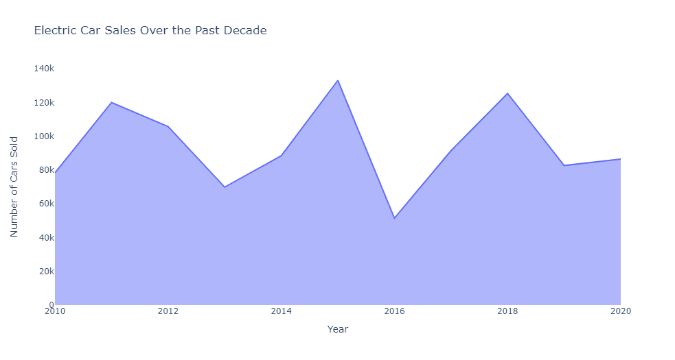
First, let’s talk about the standard area chart. Picture this: you’re scrolling through your news feed, and you come across an article about the sales of electric cars over the past decade. You see a chart that displays the sales with time on the horizontal axis (x-axis) and the number of cars sold on the vertical axis (y-axis). The area under the line that connects the data points is filled with color. That’s an area chart! It’s great for showing trends, changes, and volume over time.
An area chart can help answer questions about a single data series over time, such as:
- How has a metric (e.g., sales, revenue, or website traffic) changed over time?
- What are the trends or patterns in the data (e.g., seasonality, growth, or decline)?
- When did the metric experience peaks or troughs, and how significant were they?
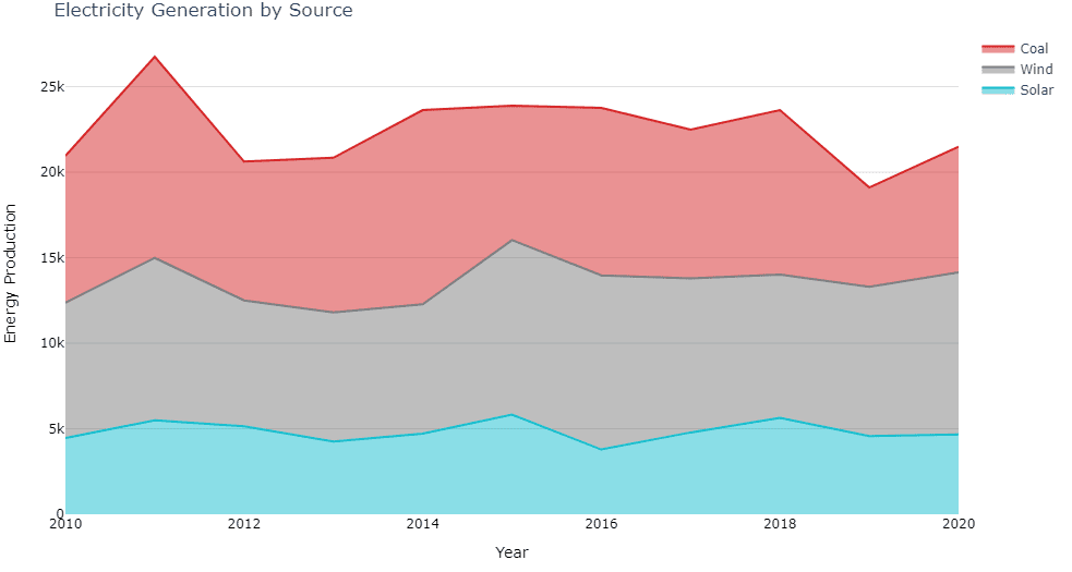
Now, let’s move on to stacked area charts. Imagine you’re looking at a blog post about the sources of electricity generation in your country over the years. The chart you see has the same x and y axes as before, but this time, there are multiple colored areas stacked on top of each other. Each color represents a different energy source, like solar, wind, or coal. The height of each colored area at any point on the x-axis represents the contribution of that source to the total energy production. This type of chart is excellent for visualizing the composition of a whole and how it changes over time.
A stacked area chart is suitable for answering questions about multiple data series over time, such as:
- How do different categories (e.g., product types, regions, or age groups) contribute to the total value over time?
- How has the overall composition of these categories changed over time?
- Which category has the largest or smallest contribution to the total value at a given point in time?
Finally, let’s discuss the 100% stacked area chart. Picture yourself scrolling through social media, and you come across a post that shares the percentage of people using different modes of transportation to commute to work in your city. The chart you see is similar to a stacked area chart, but the vertical axis (y-axis) now goes from 0% to 100%. Each colored area represents a transportation mode, like cars, bikes, or public transit. This chart type allows you to easily compare the relative proportions of each category and how they change over time.
A stacked area chart is suitable for answering questions about multiple data series over time, such as:
- How do different categories (e.g., product types, regions, or age groups) contribute to the total value over time?
- How has the overall composition of these categories changed over time?
- Which category has the largest or smallest contribution to the total value at a given point in time?
![]()
A 100% stacked area chart is helpful for answering questions related to the relative proportions of different categories over time, such as:
- What is the percentage breakdown of different categories (e.g., market share, revenue distribution, or user demographics) over time?
- How has the relative proportion of each category changed over time?
- Are there any trends or patterns in the percentage distribution of categories over time?
To recap, area charts are great for visualizing changes over time, stacked area charts for showing the composition of a whole, and 100% stacked area charts for comparing relative proportions. Keep an eye out for these charts in your daily life, and you’ll better understand the stories that data can tell!