In this article, we’re going to talk about dot plots, which are super useful when it comes to understanding data visually. There are two popular types of dot plots – the Wilkinson dot plot and the Cleveland dot plot. Let’s dive into both of them and see how they can help us make sense of the information we encounter every day.
First, let’s start with the Wilkinson dot plot. Imagine you’re reading a blog post about the height of people who attended a music concert. The author wants to show the distribution of heights, so they use a Wilkinson dot plot. Here’s how it works:
- Along the horizontal axis, you’ll see a scale representing heights, let’s say, from 50 to 80 inches.
- Each person’s height is represented by a single dot placed directly above the corresponding value on the horizontal axis.
- The dots may be stacked on top of each other, forming a vertical line or “column” above each age value.
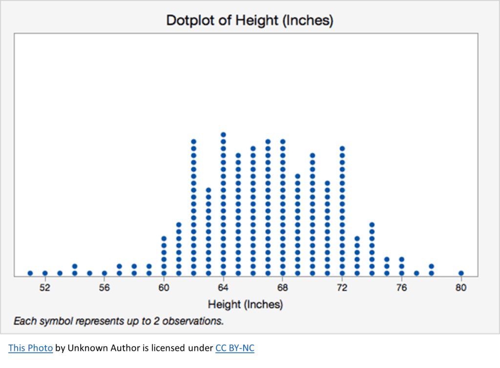
Now picture this: the taller the column, the more people of that specific age attended the concert. It gives you an instant idea of the age distribution and helps you identify patterns, like if most attendees were teenagers or if there was a more diverse age range.
Wilkinson dot plots can answer questions such as:
- What is the distribution of values for a single variable?
- Are there any outliers or unusual data points in the data?
- How do different groups or categories compare in terms of central tendency (mean or median) and dispersion (range, interquartile range)?
Now, let’s move on to the Cleveland dot plot. This one is slightly different but still super cool. Imagine you’re scrolling through your social media feed and see a post about the favorite ice cream flavors in your city. The post uses a Cleveland dot plot to display the data. Here’s how this one works:
- The horizontal axis now represents the number of people who like each flavor.
- The ice cream flavors are listed along the vertical axis, one below the other.
- A dot is placed horizontally for each flavor to indicate how many people like that flavor.
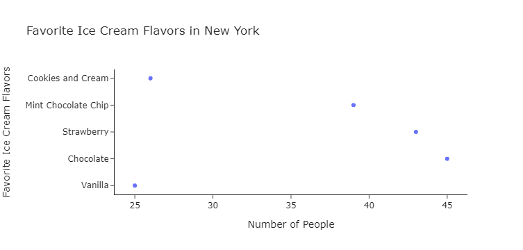
In this case, the farther the dot is from the vertical axis, the more popular the ice cream flavor. It’s easy to see which flavor is the most popular and how the other flavors compare in popularity.
Cleveland dot plots can answer questions such as:
- How do different groups or categories compare in terms of a specific variable?
- Which groups or categories have the highest or lowest values for a particular variable?
- Are there any notable patterns or trends across groups or categories for the variable of interest?
Both types of dot plots are great for quickly grasping data and understanding patterns. Remember, Wilkinson dot plots are fantastic for showing distributions, while Cleveland dot plots are ideal for comparing categories.