In this article, we’re going to explore different chart types that are great for displaying composition. Composition is all about understanding the different parts that make up a whole. So, when we’re trying to show how various elements come together to form a single entity, these are the chart types that can help us do that:
Pie chart
A classic! Imagine you’re reading an article about how people spend their time on social media platforms. A pie chart could show the percentage of time spent on Facebook, Instagram, Twitter, and other platforms. Each “slice” of the pie represents a platform, and the size of the slice indicates its share in the total time spent.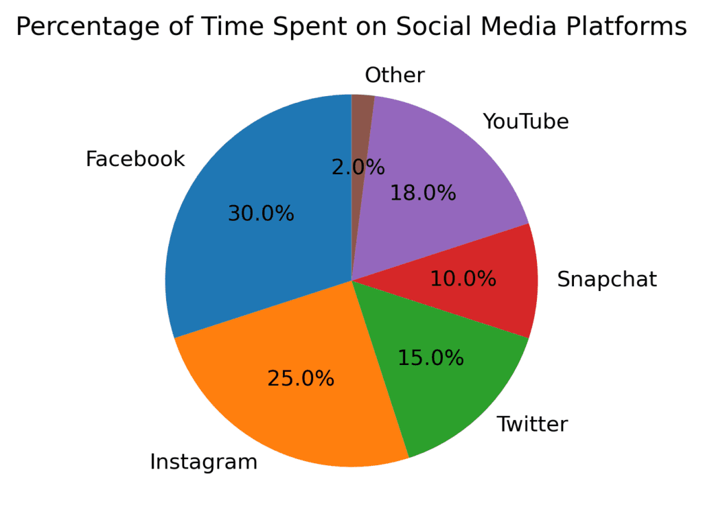
Stacked bar chart
Picture this – you’re scrolling through your news feed, and you come across a post about the sales of different types of smartphones. A stacked bar chart could show the sales of Android and iOS devices over several years, with each bar representing a year and divided into colored segments for Android and iOS sales. This way, you can easily compare the sales composition across the years.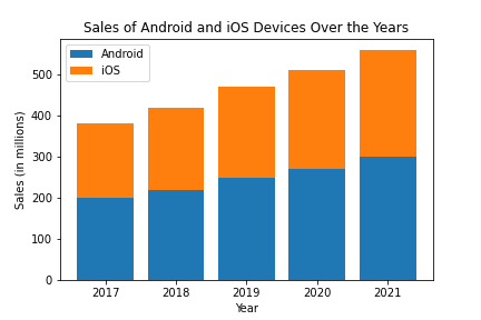
Stacked area chart
Now, let’s say you’re browsing a blog about renewable energy sources. A stacked area chart could display the share of different energy sources (solar, wind, hydro, etc.) over time. Each energy source would have its own colored area and stack on top of each other, creating a single, cohesive chart.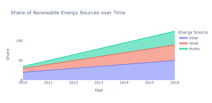
Treemap
Imagine you’re looking at a report on global carbon emissions. A treemap could show each country’s emissions share, with each rectangle representing a country. The size of the rectangle corresponds to the country’s carbon emissions, and the rectangles can be grouped together by region, allowing you to see both individual countries and broader trends.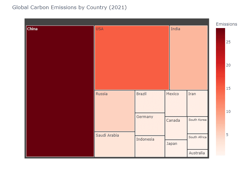
Waterfall chart
You’ve probably seen this one while reading about financial reports. A waterfall chart can display the composition of an initial value (like revenue) by showing how various factors (like the cost of goods sold, taxes, and expenses) contribute to the final value (net income). Each bar represents a contributing factor, and the chart visually “builds” from the initial value to the final result.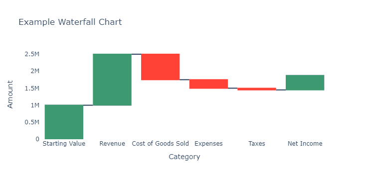
Marimekko chart
This one might be less familiar, but it’s useful for displaying the composition of two variables. Let’s say you’re interested in the market share of different car manufacturers by region. A Marimekko chart would have horizontal bars for each region, with segments for each manufacturer. The width of the bars represents the size of the region’s market, while the segments show the market share for each manufacturer within that region.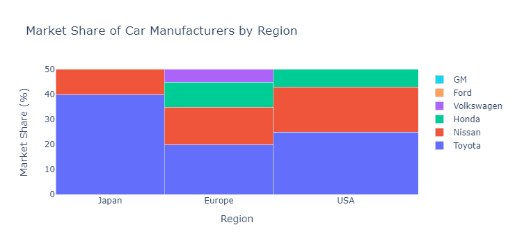
So, the next time you come across a chart while browsing the web or scrolling through social media, keep these chart types in mind. They can help you understand how various elements come together to form a whole and provide insights into the composition of the data you’re looking at.