In this article, I want to talk about some really interesting chart types that can help us understand relationships between different things. As we go through our daily lives, we often come across visual information in the news, blog posts, and even on social media. And sometimes, these visuals are specifically designed to help us see connections and trends.
Let me share some of the most common chart types that display relationships:
Scatterplots
These are super cool because they show us the relationship between two numeric variables. Imagine you’re scrolling through your social media feed, and you see a graph with a bunch of dots scattered across it. That’s a scatter plot. For example, you might see one comparing the relationship between hours spent exercising and sleep quality.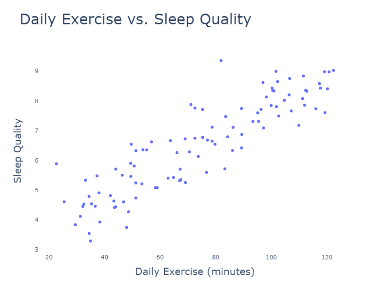
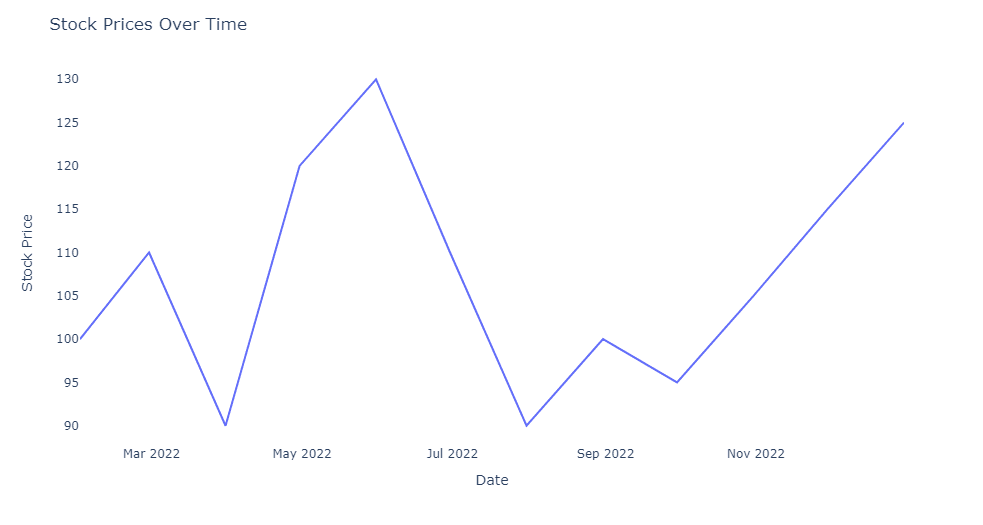
Line charts
You’ve probably seen these in news articles, comparing how things change over time. Line charts show a relationship between a continuous variable (like time) and another variable (like stock prices, temperature, or even your follower count on social media). Picture a graph with a wavy line going up and down as it moves from left to right – that’s a line chart.
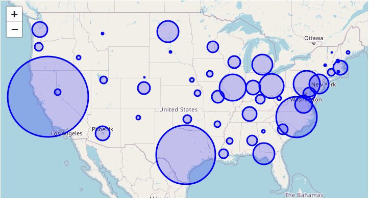
Bubble charts
These are kind of like scatter plots on steroids. They show relationships between three variables, with the size of the bubbles representing the third variable. For example, imagine a chart showing the population of each US state, with the bubbles sized according to the number of people living in each state. Bigger bubbles mean more people.
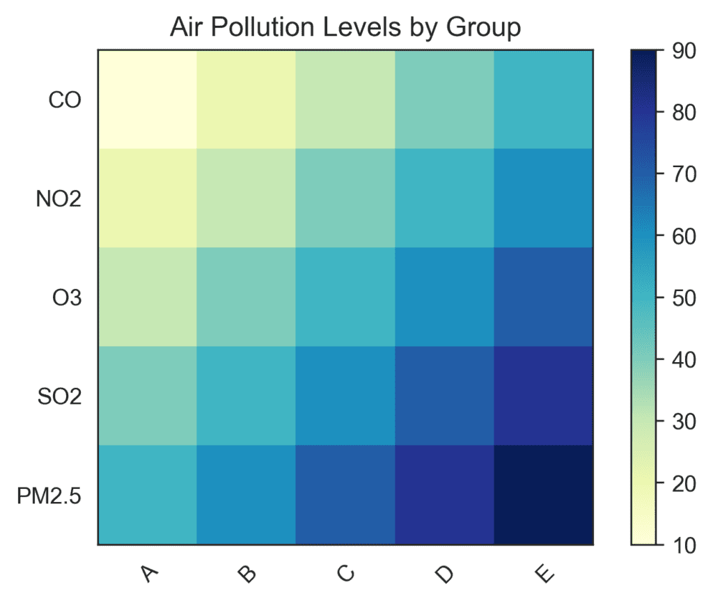
Heatmaps
These nifty charts display relationships using color intensity. They’re often used to show geographic data, like how air pollution levels vary across a city. Picture a map with different shades of color representing different pollution levels – the darker the color, the higher the pollution.
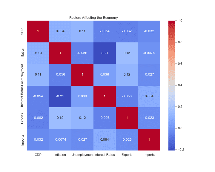
Correlation heatmap
This one is a bit more advanced, but it’s great for showing relationships between multiple variables at once. It’s like a table with colored cells, where each cell’s color intensity represents the strength of the relationship between the two variables. You might see these in blog posts about more complex topics, like the factors that influence a country’s economy.