A boxplot is a way of showing how a set of numbers is spread out. The box in a boxplot shows the middle part of the numbers, which is called the “interquartile range.”
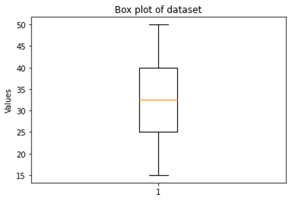
The interquartile range is the range of the middle 50% of the numbers. The bottom of the box represents the 25th percentile, which means that 25% of the numbers are below that value. The top of the box represents the 75th percentile, which means that 75% of the numbers are below that value.
So, the box in a boxplot tells us how the middle part of the numbers is spread out, and it’s a useful way to understand the distribution of data.