In this article, we’re going to talk about a fascinating type of map called a bubble map (a.k.a. a map with proportional symbols).
Picture this: you’re browsing through social media or reading a news article, and you come across a map with circles of varying sizes. These circles represent different values or quantities, and their size corresponds to the data’s magnitude. That, my friends, is a bubble map!
A map with proportional symbols can answer questions such as:
- How does a specific variable vary across different geographic regions?
- Are there any geographic patterns, trends, or clusters in the data?
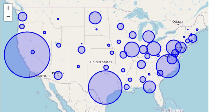
Imagine you’re looking at a map of the United States, and on this map, there are circles representing the population of each state. The larger the circle, the greater the population of that state. So, naturally, you would see a pretty big circle over California and smaller circles over states like Wyoming or Vermont. This type of visualization makes it super easy for you to grasp the information at a glance, doesn’t it?
Bubble maps are especially helpful when we want to understand the spatial distribution of a particular variable. For example, let’s say you’re interested in knowing which countries have the highest carbon emissions. Instead of going through a boring list or a table of numbers, you could look at a bubble map of the world where the size of the circles represents the number of carbon emissions per country. A large circle over China would indicate high emissions, while smaller circles over countries like Norway would show lower emissions.
A fun fact about bubble maps is that the area of the circles (not the diameter) is proportional to the data they represent. This means that if you have a circle that’s twice as big as another, it’s representing a value that’s twice as large. So, it’s essential to keep that in mind when interpreting these maps.
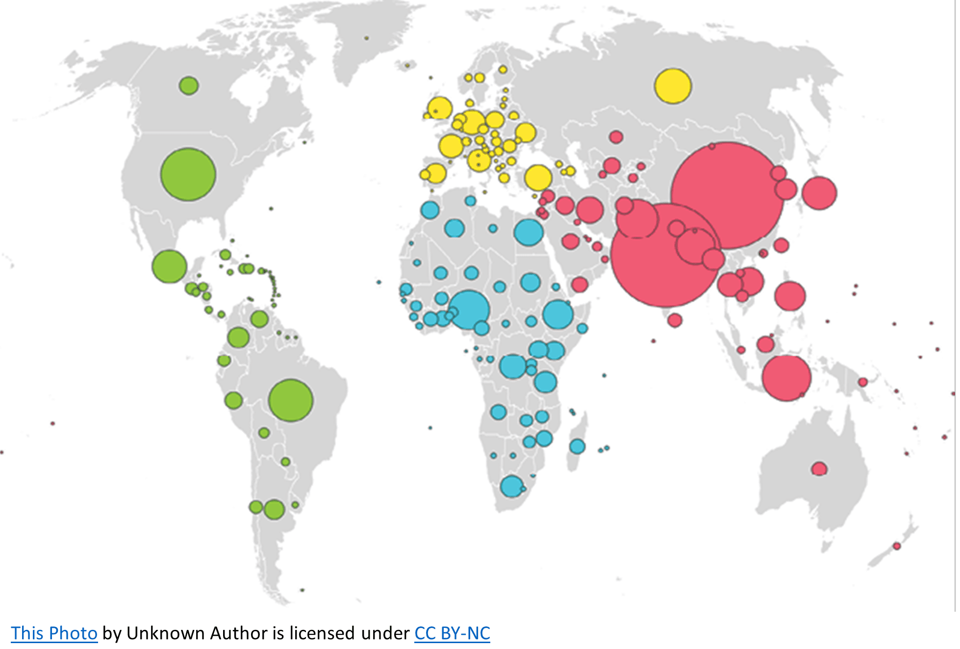
To help you visualize this concept, picture a bubble map of the world showing the population size per country. The area of the circle over China and India would be larger than the one over Russia, indicating that despite being much smaller in land mass, they have a much larger population size. The differences in circle size make it easy to see which countries have the largest population.
Bubble maps are an incredibly useful and visually engaging way to display data with a spatial component.