In this article, we’re going to talk about an awesome type of chart called a “bullet chart.” Bullet charts are really useful when you want to display a single Key Performance Indicator (KPI) along with its contexts, such as target values and performance ranges. They’re simple yet powerful and can help you quickly understand how well something is doing.
Picture this: You’re in a meeting and discussing how different groups are performing. Instead of presenting you with a big table of numbers, the boss uses a bullet chart to make it easy for you to see how each category is doing. The bullet chart displays the actual number of sales, the target sales, and a few performance ranges to show whether the sales are below expectations, meeting expectations, or exceeding expectations.
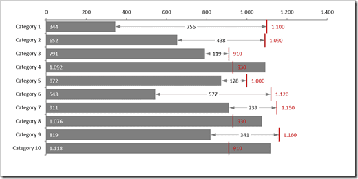
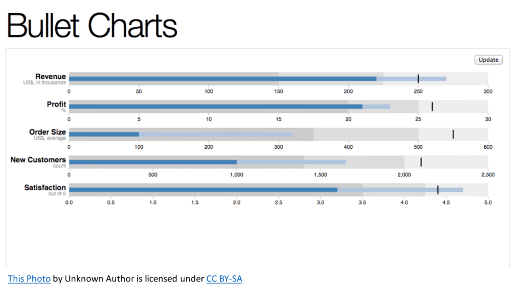
A bullet chart typically has three main components:
- The featured measure (e.g., actual sales revenue) – This is represented as a thick bar in the chart.
- The target (e.g., target sales revenue) – This is usually shown as a vertical line or marker.
- Performance ranges (e.g., underperforming, meeting expectations, and exceeding expectations) – These are displayed as different shades of color in the background of the chart, with darker shades representing better performance.
Now, imagine the bullet chart looking like a horizontal thermometer. The thick bar (actual sales revenue) starts at the left side and extends to the right, representing the current performance. The target is like a little tick mark on the thermometer, showing you where the company hopes to be. And the background shades give you a sense of how the actual performance compares to what’s expected.
Here’s a practical example: Let’s say a company’s actual sales revenue is $210 million, and its target sales revenue is $250 million. The bullet chart would display a thick bar extending to $210 million, with a vertical line at the $250 million mark. The background shades could be divided into three ranges: under $150 million (dark grey), $150 million to $225 million (grey), and over $225 million (light grey). In this case, the actual sales revenue would be in the middle (grey) zone, meaning the company is meeting expectations but not exceeding them.
Here are some questions that bullet charts can help answer:
- How close are we to achieving our target or goal? By comparing the horizontal bar’s length with the target marker, you can quickly see how much progress has been made toward the goal.
- Are we ahead or behind our target? If the horizontal bar extends beyond the target marker, it indicates that the goal has been surpassed. If the bar is shorter than the target marker, it shows that the goal has not been reached yet.
- How does our current performance compare to predefined performance thresholds? If the bullet chart includes shaded bands representing different performance levels, you can easily assess whether the current performance is poor, satisfactory, or excellent.
Bullet charts are an excellent way to communicate a single, important metric along with its context. They’re simple yet powerful and can help you quickly understand how well something is doing.