In this article, we’re going to talk about bump charts, a fantastic type of data visualization that can help us understand how rankings change over time. You might have seen these in news articles, blog posts, or even on social media when people are discussing trends or comparing different entities.
Imagine you are watching a horse race, and you want to see how the positions of the horses change throughout the race. A bump chart would be a perfect way to visualize this! It allows you to easily see which horse was ahead at any given point in the race and how their positions changed relative to one another.
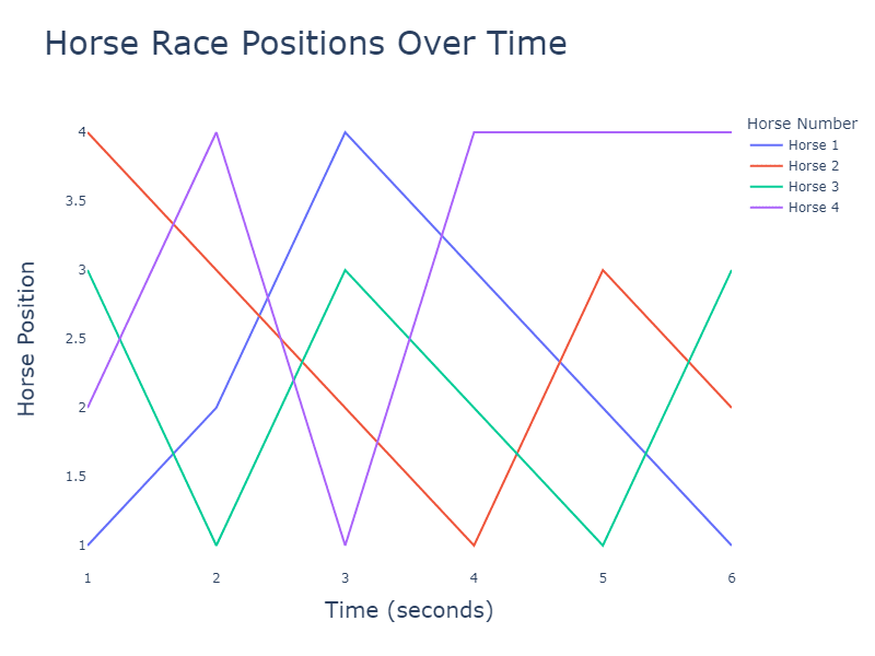
Let me give you a simple explanation of a bump chart. The x-axis represents time, while the y-axis shows the ranking or position. As the lines move from left to right, they can go up and down, showing how the rankings change over time.
Now, let’s imagine a real-world scenario where a bump chart might be useful. Suppose you’re reading an article about the top 5 smartphone brands in terms of sales over the past few years. A bump chart could be used to effectively illustrate how each brand’s ranking has evolved. You could quickly see if one brand has consistently been in the lead or if there have been any major shifts in rankings.
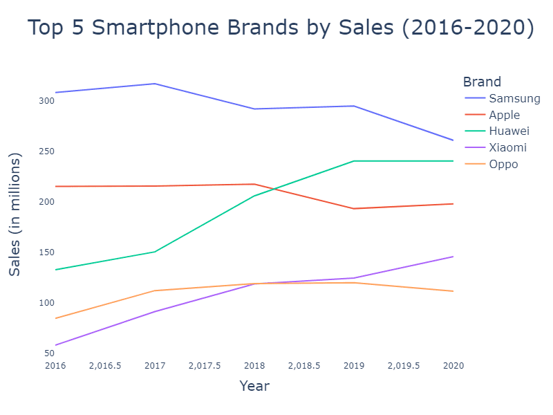
To better understand the concept, visualize a chart with five colored lines representing the smartphone brands. The x-axis would show years from 2015 to 2023, while the y-axis would show rankings from 1 (best-selling) to 5 (fifth best-selling). As you follow the lines, you can see how each brand’s ranking has changed over time, giving you a clear picture of the market dynamics.
Bump charts can answer questions like:
- How have the rankings of different categories or items changed over time? By following the lines in a bump chart, you can see how the positions of different categories or items have shifted from one-time point to another.
- Which categories or items have experienced the most significant changes in rank? Look for lines with the steepest slopes or the most “bumps,” as these represent categories or items with significant rank changes.
- Are there any patterns or trends in the ranking changes? Bump charts can reveal trends, such as a category or item consistently rising or falling in rank over time or fluctuating rankings due to external factors or events.
Bump charts are incredibly versatile and can be applied to a wide range of topics – from sports rankings to movie box office performances to even the popularity of different baby names over time!