In this article, we’re going to discuss a really interesting topic – chart types. You might be wondering why it is important to be familiar with types of charts when interpreting visual information. The answer is simple: it helps us better understand the data and make more informed decisions.
A chart type is basically a way to represent data visually. There are many different types of charts, but some common ones you might see in the news, blog posts, or on social media include:
- Bar charts
- Line charts
- Pie charts
- Scatter plots
- Area charts
Let’s dive into each and see how they can help us better understand the data.
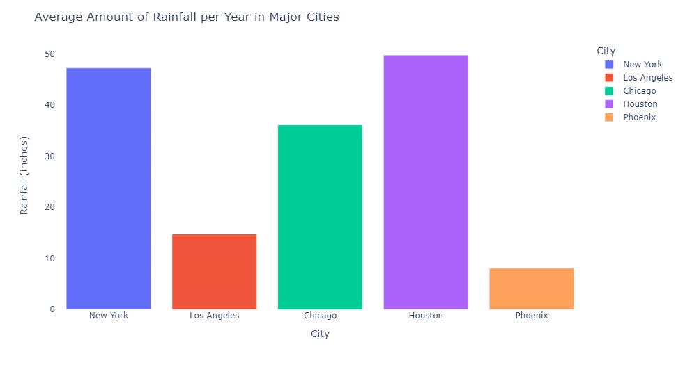
Bar charts are great for comparing different categories. For example, imagine you’re looking at a blog post about the average monthly rainfall in different cities. A bar chart would display each city with its own bar, and the height of the bar would represent the amount of rainfall. This makes it easy to see which city gets the most rain and which gets the least.
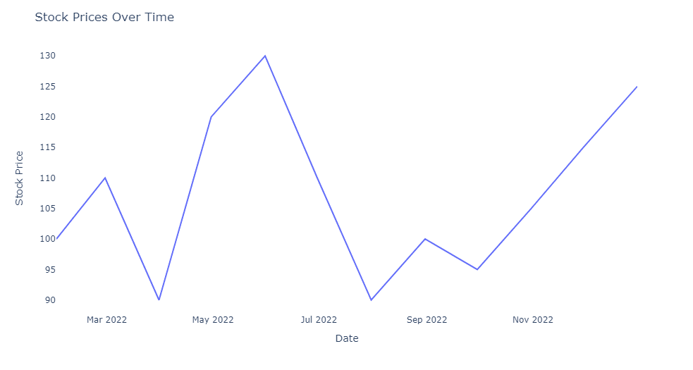
Line charts are perfect for showing trends over time. Let’s say you’re reading a news article about the stock market and want to see how a specific company’s stock price has changed over the past year. A line chart would have the dates on the x-axis and the stock price on the y-axis, with a line connecting each data point. This way, you can easily see if the price went up or down over time.
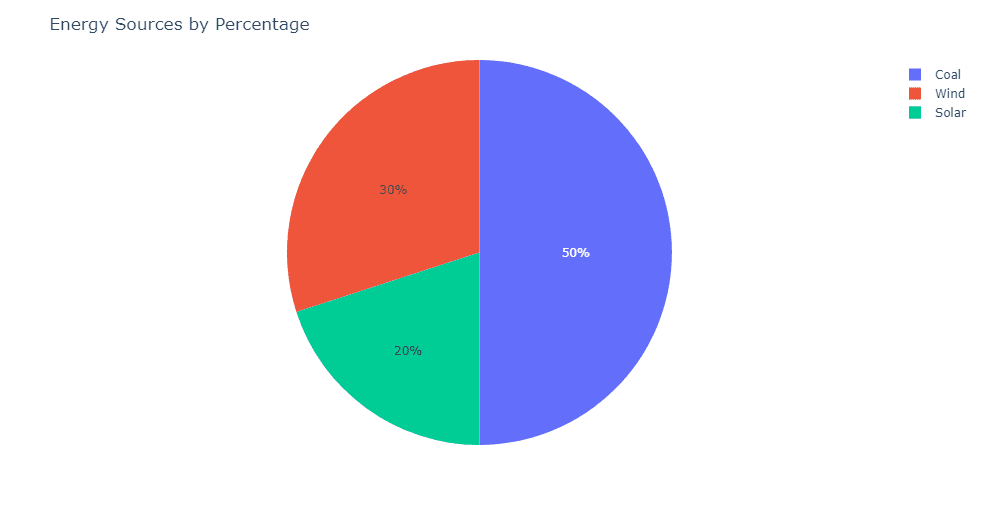
Pie charts are useful for showing proportions or percentages. For example, imagine you’re browsing social media and come across an infographic about the distribution of different types of energy sources in your country. A pie chart would be a great way to represent this data, as each slice of the pie would represent a different energy source, and the size of the slice would show the percentage of the total energy mix.
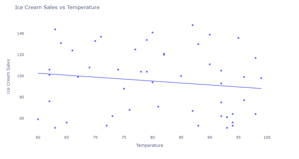
Scatter plots are excellent for identifying relationships between two variables. For instance, suppose you come across a blog post discussing the correlation between average daily temperature and ice cream sales. A scatter plot would have data points representing each day, with the x-axis showing the temperature and the y-axis showing ice cream sales. This would help you see if there’s a pattern between the two variables.
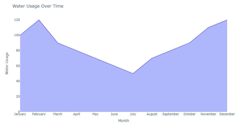
Area charts are similar to line charts but with the area between the line and the x-axis filled in. This type of chart is helpful for visualizing quantities over time, especially when you want to emphasize the total amount. For example, if you’re reading an article about the total amount of water used in a city over a year, an area chart could show the water usage on the y-axis and the months on the x-axis, with the area under the line representing the cumulative water usage.
By being familiar with these chart types, you’ll be better equipped to understand and interpret the visual information you encounter in your everyday life.