Funnel charts are a fantastic way to visualize and understand data, particularly when it comes to displaying a process or a sequence of events that gradually narrows down as you move forward.
Imagine you’re looking at a sales process. At the very beginning, you have a large number of potential customers who might be interested in your product. As the process progresses, some of these potential customers become leads, and eventually, a smaller portion of them make a purchase. A funnel chart is perfect for visualizing this kind of data, as it starts wide at the top and narrows down towards the bottom, representing the decreasing number of people at each stage of the process.
Think of a funnel chart like an upside-down pyramid or an actual funnel, where the top part represents the initial stage with the most significant number of items or people, and the lower stages represent the gradually decreasing numbers as you progress through the process.
Funnel charts can answer questions such as:
- How do the values of a variable change across different stages in a process or funnel?
- At which stages do the most significant changes or drop-offs occur?
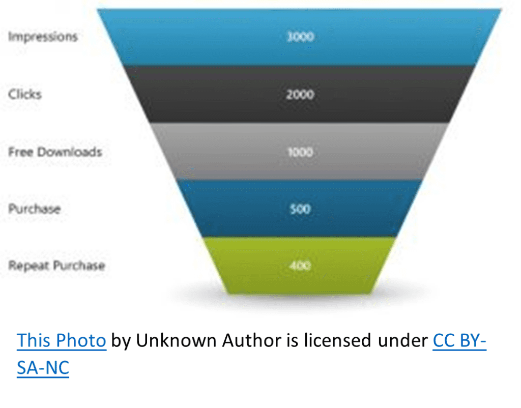
Now, let’s say you’re browsing your favorite news website and coming across an article about how people interact with a particular website. You might see a funnel chart illustrating the different levels of interaction, from the initial number of people on who the website makes an impression to those who click on the site, download something for free, make a purchase, and finally, become repeat purchasers.
Here’s a quick breakdown of a funnel chart:
- Top of the funnel: Large rectangle representing the total number of job seekers.
- Second stage: Smaller rectangle representing those who submitted resumes.
- Third stage: Even smaller rectangle representing those who got interviews.
- Bottom of the funnel: The smallest rectangle representing those who successfully landed a job.
Funnel charts are great for visualizing these types of processes because they make it easy to see where the most significant drop-offs occur and identify potential areas for improvement.