In this article, we’re going to talk about a super useful visualization tool called the Gantt chart. This type of chart is really helpful for managing projects and understanding timelines. You’ve probably seen some kind of Gantt chart before, like when you’re checking the progress of your favorite construction project or keeping track of a team’s work on a new app or product.
Imagine you’re planning a big event, like a wedding or a conference. There are many tasks to complete, and they all have different start and end dates. You need a way to visualize all these tasks and their timelines, so you can see how they overlap and make sure everything gets done on time. This is where the Gantt chart comes in handy!
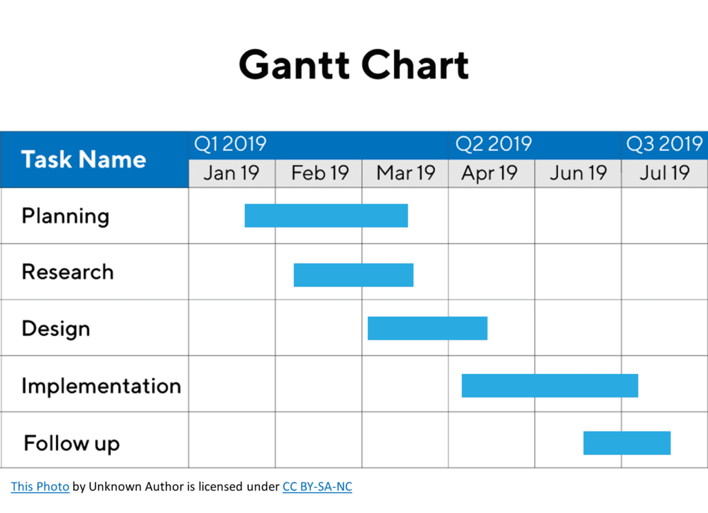
A Gantt chart is a horizontal bar chart that represents a project’s schedule. Each task is represented by a horizontal bar, with the bar’s length showing the task’s duration. The position of the bar on the chart indicates the start and end dates of the task.
To give you a better idea, picture a chart with two axes: the vertical axis shows a list of tasks, while the horizontal axis represents time. Now, let’s say we’re planning a product release. Some tasks, like planning or research, might take multiple months. Others, like following up, could take a few weeks. You’d see bars of different lengths on your Gantt chart, each one corresponding to a specific task.
Gantt charts are super useful because they help you:
- Visualize the overall project timeline and individual task durations.
- Understand task dependencies, meaning which tasks need to be completed before others can start.
- Monitor progress and identify potential bottlenecks or delays.
Gantt charts can answer questions such as:
- What is the timeline or schedule of tasks or events within a project?
- How do different tasks or events within a project overlap or depend on each other?
You might have seen a Gantt chart about a major infrastructure project, like a bridge or a subway line, in a news article. These charts help everyone understand the project’s timeline and ensure all stakeholders are on the same page.