In this article, we’re going to dive into an interesting topic – heatmaps. You might have seen these colorful visuals in the news, blog posts, or on social media, and they are super useful in helping us understand complex data more easily.
So, what is a heatmap? A heatmap is a data visualization technique that uses color to represent different values in a dataset. Imagine a grid, with each cell representing a specific data point and the color of each cell varying according to the value it represents. The colors can range from cool (like blue or green) to hot (like red or orange) or any other color scheme, depending on what makes the most sense for the data you’re trying to visualize.
Heatmaps can answer questions such as:
- How do values in a table compare across rows and columns?
- Are there any patterns, trends, or clusters in the data?
Let’s use a practical example to illustrate this concept. Imagine we have data about the number of ice cream sales across a city. We could represent this data on a heatmap, where each cell on the grid represents a neighborhood, and the color of the cell indicates the number of ice cream sales. The cooler colors (like blues) would represent lower sales, and the hotter colors (like reds) would represent higher sales.
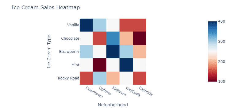
A heatmap like this could help us quickly identify which neighborhoods sell the most ice cream and which ones might need a little marketing boost! You can think of it as a visual way to “feel the heat” of the data.
Another great example is when we want to understand the correlation between different variables. Let’s say we’re looking at how much people exercise and their overall happiness. We can create a heatmap with one axis representing exercise frequency and the other representing happiness levels. Each cell in the heatmap could represent the number of people with that specific combination of exercise and happiness, with the color indicating the density of people in that category.
A useful feature of heatmaps is that they can also be interactive! For example, if you come across a heatmap online, you might be able to hover your cursor over a cell to see the exact value it represents. This can give you even more information about the data.
Heatmaps are a powerful visualization tool that uses color to represent data values, making it easier to spot patterns, trends, and outliers in the data. They can be used in various contexts, from analyzing sales data to understanding correlations between different variables.