A line chart is simply a chart that shows data points connected by straight lines. The data points are usually plotted on a two-dimensional plane, with the horizontal axis (x-axis) typically representing time and the vertical axis (y-axis) representing the value of a variable. The main purpose of a line chart is to show how the variable’s value changes over time.
Line charts can answer questions such as:
- How does a variable change over time or across a continuous dimension?
- Are there any patterns, trends, or anomalies in the data?
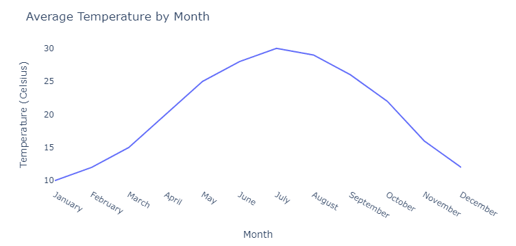
Imagine you’re looking at a line chart showing the average temperature of your city throughout the year. The x-axis would represent the months (from January to December), and the y-axis would represent the temperature. The line would then connect the average temperature for each month, allowing you to see how the temperature changes as the year progresses.
Now, let’s talk about multi-line charts. These are just like regular line charts but with more than one line. They’re useful when you want to compare multiple variables or datasets over the same time period. Each line represents a different variable or dataset, and they’re usually displayed with different colors or patterns to make them easy to distinguish.
Multi-line charts can answer questions such as:
- How do multiple variables or categories change over time or across a continuous dimension?
- Are there any similarities, differences, or interactions between the variables or categories?
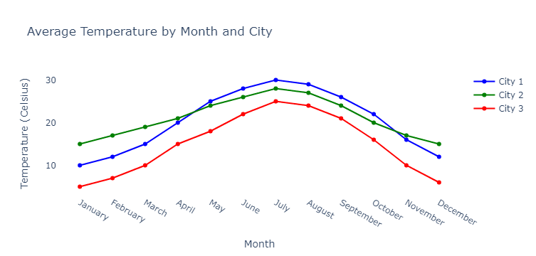
Suppose you’re comparing the average temperatures of three different cities over a year. In this case, you’d have a multi-line chart with three lines – one for each city. Just like with a single line chart, the x-axis would represent the months, and the y-axis would represent the temperature. Each line would show the temperature trend for one of the cities, allowing you to compare their climates easily.
To help visualize these concepts, you can check out websites like “The New York Times” or “FiveThirtyEight” which often use line and multi-line charts to illustrate data-driven stories. Pay attention to how the charts are laid out, the colors used, and how easy it is to understand the information being presented.