In this article, we’re going to learn about an interesting chart called the Pareto chart. It’s a simple yet powerful visualization tool that helps us identify the most significant factors in a particular dataset.
The Pareto chart is named after Vilfredo Pareto, an Italian economist who discovered the 80/20 rule. This rule, also known as the Pareto principle, states that roughly 80% of the effects come from 20% of the causes. In other words, a small number of factors are responsible for a large portion of the results.
Pareto charts can answer questions such as:
- Which categories contribute the most to a specific outcome or variable?
- How do different categories cumulatively contribute to the total value?
- Which categories can be prioritized for action or improvement based on their impact?
Imagine you’re looking at a chart that shows reasons for being late to work. A Pareto chart would help you identify which factors contribute the most to being late, so you can focus on fixing those issues first.
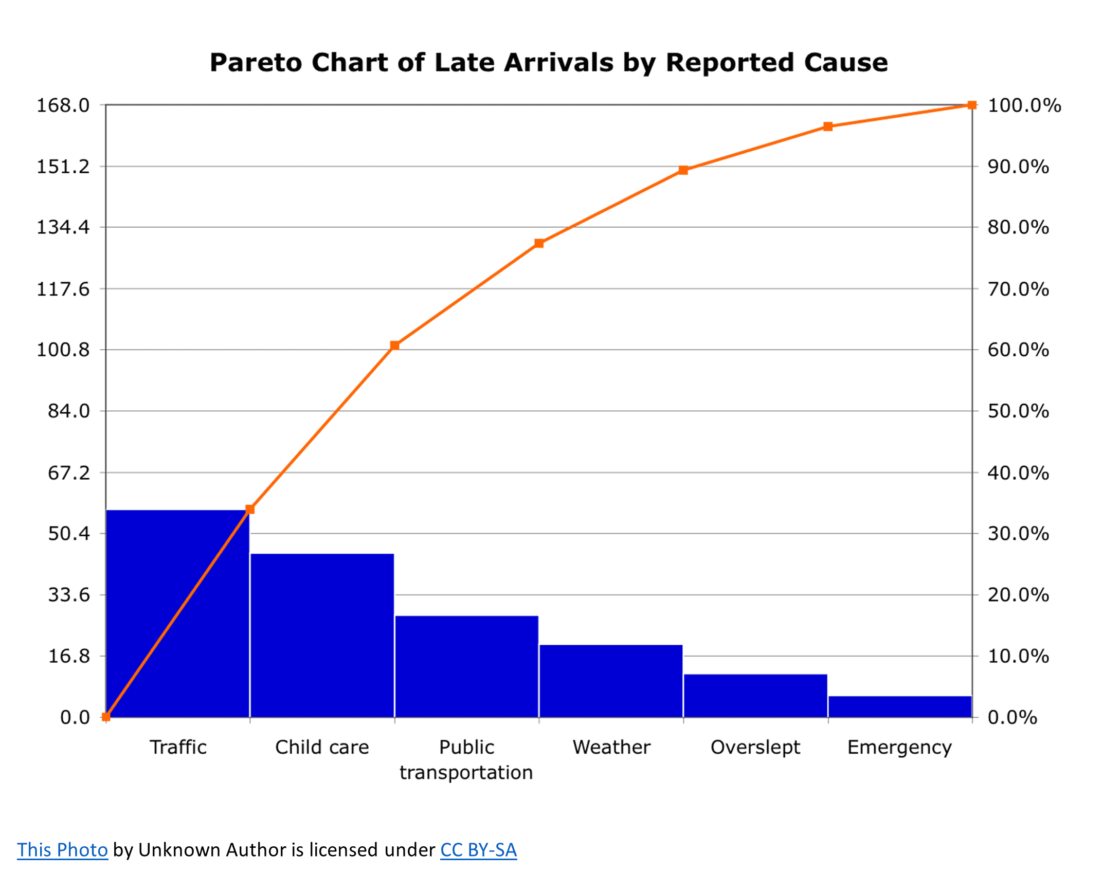
A Pareto chart is a combination of a bar chart and a line chart. The bar chart displays individual categories sorted in descending order, while the line chart shows the cumulative percentage of those categories. The x-axis represents the categories, and the y-axis represents the frequency or percentage. The line graph will start from the first bar and usually rise to 100% at the last bar.
Let me give you an example. Imagine you’re a city planner and want to find out which traffic issues cause the most accidents in your city. You gather data on different factors like speeding, distracted driving, bad weather, and so on.
To create a Pareto chart, first, you’d sort these factors based on the number of accidents they cause, from highest to lowest. Then, you’d calculate the cumulative percentage for each factor. In the end, you might find out that 80% of accidents are caused by just 20% of the factors, like speeding and distracted driving. With this information, you could focus your resources on addressing these two major causes to reduce overall accidents.
A Pareto chart is a simple yet powerful way to identify the most significant factors in a dataset, helping you prioritize your actions and make more informed decisions.