Have you ever come across a circular chart divided into segments, in a news article or on social media? That’s called a pie chart, and it’s a fantastic way to visualize data. In this article, I’ll explain what a pie chart is, its variations like the donut chart, and how you can easily understand the information.
So, a pie chart is a circular chart divided into segments or “slices.” Each slice represents a portion of the whole, and the size of each slice is proportional to the value it represents. It’s like cutting a pizza into pieces, where each topping represents a different data category, and the size of the slice shows how much of that topping is on the pizza.
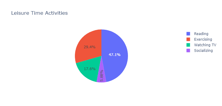
For example, imagine you see a pie chart in a blog post about how people spend their leisure time. The chart might show slices for watching TV, reading, exercising, and socializing. A larger slice for watching TV would indicate that, on average, people spend more time watching TV than other activities.
Pie charts can answer questions such as:
- What is the proportion of each category within a whole?
- Which categories represent the largest or smallest parts of the whole?
Now, let’s talk about a variation of the pie chart – the donut chart. It’s quite similar to a pie chart, but it has a hole in the center, making it a donut. The donut chart can display multiple data series or groups, and it’s easier to read when comparing the size of the segments.
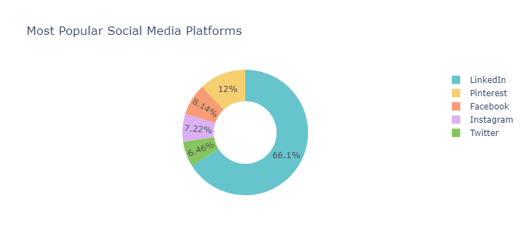
Picture this: you come across a donut chart in a news article about the most popular social media platforms. The chart is divided into different colored segments, each representing a platform like Facebook, Instagram, Twitter, and so on. The size of each segment shows the proportion of users for each platform. If the Facebook segment is the largest, it means that Facebook has the most users compared to other platforms.
Donut charts can answer questions such as:
- How do the proportions of different categories compare within a whole?
- Which categories represent the largest or smallest parts of the whole?