A radar chart, also known as a spider chart or polar chart, is a unique way to display data with multiple variables or dimensions. It’s great for comparing multiple items, allowing you to quickly see their strengths and weaknesses. Let’s say you’re reading a blog post comparing different smartphone types or even browsing social media posts about various diets.
Here’s how a radar chart works:
- Imagine a circle, and we divide it into equal sections, like slices of a pie. Each slice represents one variable or dimension of the data.
- We place a central point in the middle of the circle, which is the lowest value (usually zero) for each variable.
- We draw a scale along each slice outward from the central point. The further you go out, the higher the value for that variable.
- Now, we can plot the data points for each item on the corresponding scales. By connecting these points, we form a shape for each item.
- Finally, we can compare these shapes to see which item performs better in certain areas.
Radar charts can answer questions such as:
- How do different variables or categories compare across multiple dimensions?
- Are there any similarities or differences between variables or categories across the dimensions?
- Which dimensions have the highest or lowest values for each variable or category?
Let’s use a real-world example to help visualize the concept. Imagine you’re comparing three smartphones: Phone A, Phone B, and Phone C. We want to compare them based on five factors: battery life, camera quality, storage capacity, display quality, and price.
Visualize a radar chart with five slices, each representing one of these factors. We plot data points on the appropriate scales for each smartphone and connect them to form a shape. Now we can easily see which smartphone has the best battery life, the highest storage capacity, or the most affordable price by comparing the shapes on the chart.
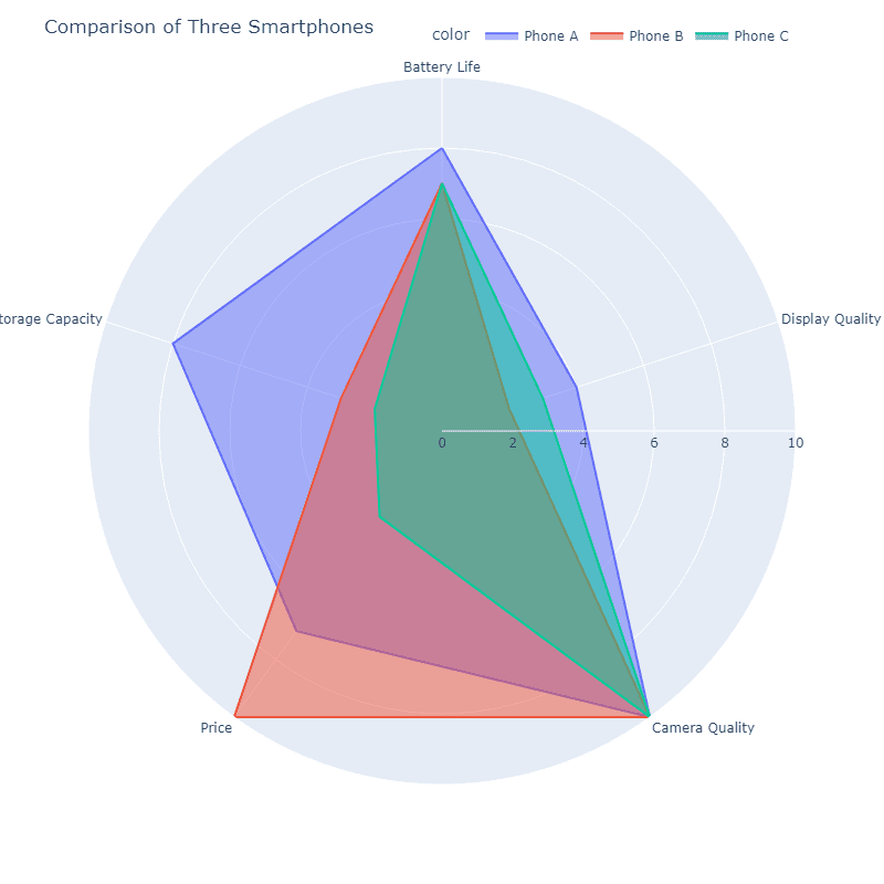
The beauty of a radar chart is that it allows us to see how well-rounded each item is. If one shape is larger than the others, the item performs better overall. If a shape has a very long spike in one area but is small in others, it means the item excels in that particular aspect but might be lacking in other areas.