Have you ever seen those cool flow charts that show how things are connected and how they move from one stage to another? They might look a bit like a river system, with branches merging and splitting, but they’re actually called Sankey diagrams. Let me explain what they are and why they’re so awesome.
A Sankey diagram is a type of flow diagram that helps visualize the flow of quantities, such as energy, materials, or costs, between different stages or components of a system. The width of each arrow in the diagram is proportional to the amount of the quantity it represents. This makes it super easy to understand the flow of resources and see which parts of the system are more significant than others.
Sankey diagrams can answer questions such as:
- How do values flow through a system or process from one stage to another?
- What are the proportions of different categories or paths in the flow?
- Where are the flow’s most significant changes, losses, or gains?
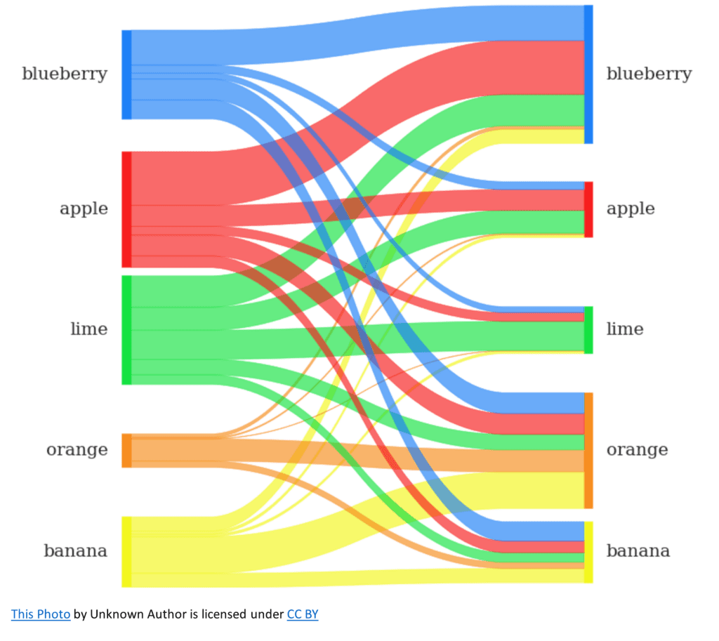
Imagine you’re reading a news article about ordering patterns at your local supermarket. A Sankey diagram would be an excellent way to show how someone’s fruit purchase history contributes to the likelihood of them ordering different fruits in the future. By looking at the diagram, you could easily see the connections between previous orders on the left and what would be expected for future orders on the right just by following the connected lines and noting their widths.
Another great example could be visualizing the flow of money in a government budget. You’d see the different sources of income, like taxes, and then how that money is distributed among different departments or programs. This would help you easily understand which programs receive the most funding and where the majority of the budget is allocated.
Let me share a simple way to create a mental image of a Sankey diagram. Picture a tree with its trunk representing the main input or source and the branches symbolizing the flow of the quantity. As you move from the trunk to the branches and then to the leaves, you’ll see the flow split, merge, or change direction, just like the arrows in a Sankey diagram. By observing the widths of the branches, you can quickly grasp the distribution and flow of the quantity being visualized.
Sankey diagrams are fantastic tools for visualizing complex systems, and they can be a great way to communicate important information in an easy-to-understand format.