A scatterplot is a chart displaying the relationship between two variables. Imagine you have a grid, and on this grid, you plot individual data points based on their values for two different variables. One variable is represented on the horizontal axis (x-axis), and the other variable is represented on the vertical axis (y-axis). The position of each data point indicates its values for both variables. The great thing about scatterplots is that they let you visually see patterns or trends in the data.
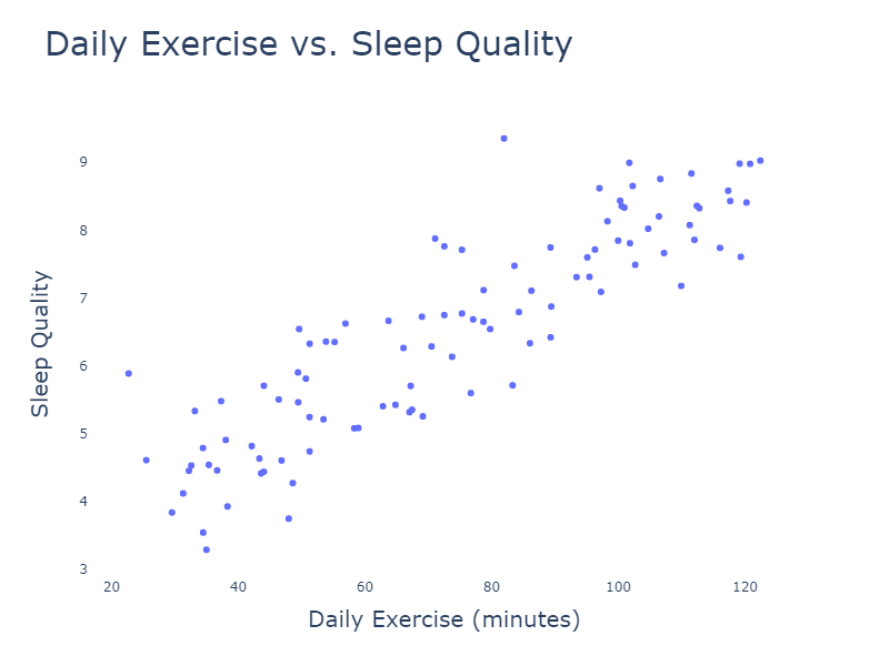
For example, let’s say you’re interested in how daily exercise affects sleep quality. You could plot a scatterplot with daily exercise time on the x-axis and sleep quality (measured on a scale of 1 to 10) on the y-axis. Seeing the points forming an upward trend could suggest that more daily exercise is associated with better sleep quality.
Scatterplots can help answer questions like:
- Is there a relationship between the two variables?
- What is the direction of the relationship (positive or negative)?
- How strong is the relationship between the variables?
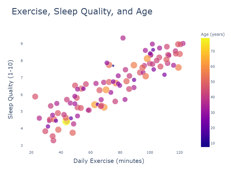
Now, let’s talk about bubble charts. A bubble chart is a variation of a scatterplot that adds a third variable to the mix. In addition to the x and y-axes, bubble charts represent a third variable by the size of the data points (or bubbles). Larger bubbles correspond to larger values of the third variable, and smaller bubbles correspond to smaller values.
Let’s go back to our exercise and sleep quality example. Suppose we also want to consider the age of the individuals in our study. In this case, we can use a bubble chart to visualize the relationship between daily exercise, sleep quality, and age. The x and y-axes would still represent exercise time and sleep quality, respectively, but now the size of each bubble would represent the age of the individual. This way, you can quickly see how age might play a role in the relationship between exercise and sleep quality.
Bubble charts can help answer questions like:
- How does a third variable influence the relationship between the first two variables?
- Are there any trends or patterns related to the third variable?
- Are there any outliers or unusual data points in the data?
Both scatterplots and bubble charts are powerful visualization tools that can help us understand complex relationships in the real world. By using these charts, we can better comprehend the data we encounter in our everyday lives and make more informed decisions.