In this article, we’re going to talk about a really interesting type of data visualization called a slope graph. You might have seen these graphs in news articles, blog posts, or even on social media. They are helpful in understanding data changes over time, especially when comparing different groups or categories.
A slope graph is essentially a line chart that focuses on comparing the changes between two points in time. It usually consists of two vertical axes, one on the left side representing the initial time point and one on the right side representing the final time point. You’ll find lines connecting the data points of each group or category between these two axes, hence the name “slope graph.”
Slope graphs can answer questions such as:
- How have values for different categories or variables changed between two-time points or conditions?
- Which categories or variables have experienced the largest or smallest changes?
- Are there any trends or patterns in the changes across categories or variables?
Let’s use a real-world example to illustrate this concept. Imagine you come across a blog post discussing the changes in life expectancy in different countries over a decade. A slope graph would be perfect for visualizing this data.
To create a slope graph, you would have the countries listed on both the left and right vertical axes, with each country’s life expectancy at the initial year on the left axis and the life expectancy at the final year on the right axis. You would then draw lines connecting the data points for each country, creating a series of slopes.
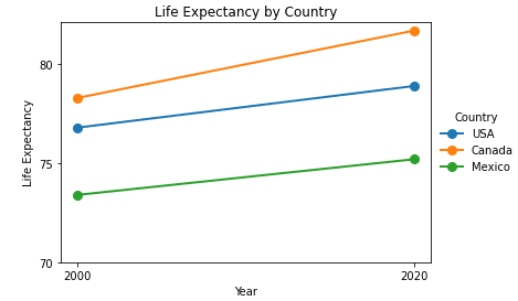
This visual representation can quickly reveal trends and changes in life expectancy across countries. For instance, if you see a line with a positive slope, it means life expectancy has increased in that country. On the other hand, if you see a line with a negative slope, it means life expectancy has decreased.
Now, imagine you come across a social media post showing a slope graph comparing the average annual income of men and women over a five-year period. You’d see two vertical axes, one for the initial year and another for the final year, with the average income of men and women displayed as data points. Lines connecting the data points would help you quickly understand the changes in income and whether the income gap has widened or narrowed.
Slope graphs are a fantastic way to present complex data in a simple and easy-to-understand way, allowing you to spot trends and draw conclusions with just a quick glance.