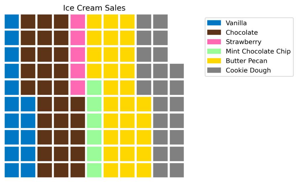
A waffle chart is essentially a square grid where each cell represents a portion or percentage of the whole. These charts are great for displaying proportions, like election results or the composition of a population. Let me give you an example to illustrate this better.
Picture this: you’re reading a news article about the popularity of different ice cream flavors. You see a diagram with 100 little squares representing 1% of the total ice cream sales. The squares are colored differently to show the sales of different flavors. So, if 30 squares are colored brown for chocolate, it means that 30% of the ice cream sales were chocolate flavored. Isn’t that a cool and easy way to understand data?
Waffle charts can help you answer questions such as:
- How do different parts or categories contribute to a whole?
- What is the percentage breakdown of each category?
- How do categories compare to one another in terms of proportion?
Let’s go through another example. Imagine you’re browsing a blog post about energy consumption in your country. The post has a waffle chart showing how much energy comes from different sources. The chart is divided into 100 squares, with different colors representing each energy source. If 40 squares are green for solar energy, it means that 40% of the total energy consumption comes from solar power. This makes it super simple for you to grasp the information.
Waffle charts are fantastic for communicating percentages, especially when you’re dealing with a non-technical audience. They’re visually attractive, and people can quickly grasp the data just by glancing at the chart.