In this article, we’re going to talk about what an isopleth is, a super interesting concept in data visualization. Isopleths are contour lines that connect points of equal value on a map or chart, and they help us understand various patterns and distributions in data. You might have encountered them on weather maps, topographic maps, or social media!
Let’s dive into some real-world examples to make this concept more relatable:
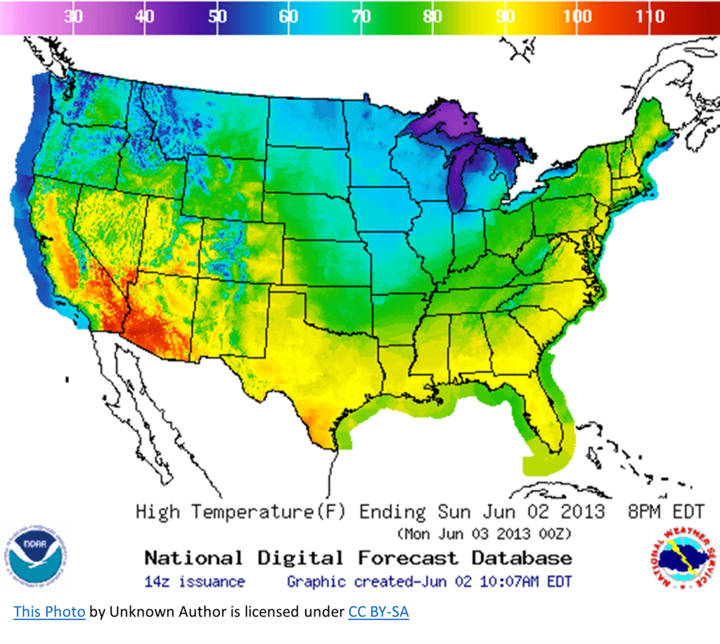
- Weather Maps: Have you ever seen those lines on weather maps that show temperature, pressure, or even rainfall? Those are isopleths! For example, you might see a line connecting all the points with the same temperature, which helps you visualize how the temperature changes across a region.
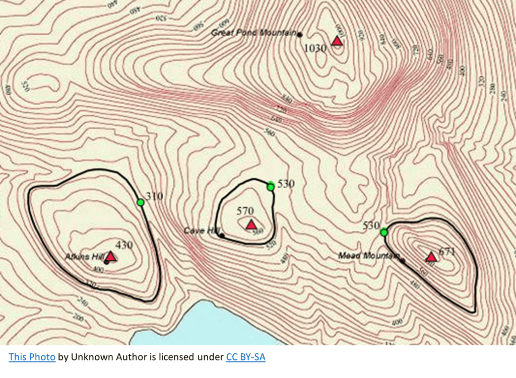
- Topographic Maps: Hikers and geographers often use topographic maps to understand the elevation of different points in a terrain. In this case, isopleths are called contour lines, and they connect points with the same elevation. This helps you see where the steep slopes or flat areas are.
Now, let’s look at some visuals to better illustrate the concept of isopleths!
- Imagine a simple weather map with colored lines showing the temperature across a region. The colors might range from blue (for cooler temperatures) to red (for warmer temperatures). The lines would represent different temperature levels, and the space between the lines would show you how rapidly the temperature changes in that area.

- Picture a topographic map with wavy lines representing the elevation of a mountainous region. The closer these lines are to each other, the steeper the terrain. By looking at these lines, you can determine if you’re about to face a steep climb or a gentle slope during a hike.

Isopleths can answer questions such as:
- How does a continuous variable change across a geographic area?
- Are there any spatial patterns or gradients in the data?
Isopleths are super helpful because they let us visualize complex information in an easy-to-understand way. Connecting points of equal value creates a visual representation that helps us make sense of patterns and trends in data.