Imagine for a moment that you’re standing in the middle of your favorite shopping center, right in front of the perfect display of vibrantly-colored fresh fruit. It’s a very common situation, right? Now, let’s make it a little more interesting. Suppose you need to pick the best possible apples for your family. How do you do it?
You might look at the color, the size, the weight of the apples – you want to know how these qualities are spread among the different apples available. Are most of them ripe? Are there many small or overly large ones? This thought process, my friends, is an instinctive, everyday act of analyzing distribution – without us even realizing it.
Now, just imagine if we could take that innate skill we all have and apply it not just to choosing apples but to understanding complex data sets, drawing meaningful conclusions, and making informed decisions in different aspects of our life, be it in our personal finance, in our work, or in global issues.
In the world we live in today, data is not just numbers or facts anymore – it’s the language in which the stories of our time are written. And charts, they’re the pictures that tell these stories. Understanding different chart types that show distribution, in this context, is much like recognizing different fruits in the supermarket – it’s the key to choosing the right ones for our specific needs.
Today, we’re going to unlock the power of that data language by exploring the exciting world of distribution charts. We’re going to learn how to identify them, interpret them, and use them in our everyday lives. We’re going to make data our ally, helping us understand the world and make more informed decisions.
 Histogram: The Skyline Story
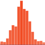 Histogram: The Skyline Story
Imagine a city skyline with skyscrapers of different heights. That’s a histogram! A histogram tells us about the distribution and frequency of a dataset or a continuous variable. They show us how something like test scores or the heights of athletes in a basketball team is spread out. Each bar or “building” in our skyline represents a range or ‘bin’ of scores or heights, and its height tells us how many students fall into that range. But remember, just like moving buildings in a city can change its skyline, changing the size of these ‘bins’ can alter your histogram!
Important facts about histograms:
- A histogram shows the distribution of a single variable by dividing the data into bins of equal width and representing the frequency of values in each bin by the height of the bar.
- It allows you to see the central tendency, spread, and shape of the distribution.
- Histograms are excellent for displaying the overall distribution of large datasets.
- They don’t show individual data points.
Be aware that changing the size of the bins can drastically alter the shape of the histogram, potentially obscuring important features of the data.
Stem-and-Leaf Plot: The Leafy Tale
A stem-and-leaf plot is like a tree that grows in numbers! A stem and leaf plot, also known as a stemplot, tells us about the distribution and individual values of a dataset. It breaks down each number in our data into a “stem” and a “leaf”. Say your team did the long jump and got these results: .9′, 1.2′, 1.8′, 1.3′, 1.9′, 1.5′, 2.0′, 2.3′. The stem (like a tree trunk) would be the whole number (0, 1, or 2), and the decimals are the leaves (.9, .2, .8, etc.). It’s okay if the leaf values repeat, but the trunks shouldn’t. This chart is great because it shows us each score, but for big data like everyone’s score in the entire school, our tree can get a little too leafy!
Important facts about stem-and-leaf plots:
- A stem-and-leaf plot shows the distribution of a quantitative variable by separating each value into a “stem” (all but the last digit) and a “leaf” (the last digit).
- It shows the frequency and allows you to see individual data points.
- Unlike histograms, stem-and-leaf plots retain the original data to a certain degree.
- They are not useful for very large datasets or when data has many unique values.
Watch out as stem-and-leaf plots can become unwieldy with large datasets, and they assume that data are rounded to the nearest whole number.
Density Plot: The Smooth Wave
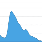 Density Plot: The Smooth Wave
A density plot is like a smooth sea wave showing how our data is spread. Instead of bars or leaves, we have a smooth line showing us the distribution and shape of a continuous variable. It shows how the data is spread out along the range of values and gives us an idea of the likelihood of observing different values. Just remember that the smoothness of our wave depends on our ‘bandwidth.’ Too much smoothing, and we might lose some important bumps in our wave!
Important facts about density plots:
- A density plot is a smoothed version of a histogram showing the probability density function of the data.
- It provides a visual interpretation of how data points are distributed across the range.
- Density plots can more clearly reveal the shape of a distribution and are particularly useful for comparing distributions.
- They don’t show individual data points and can be more abstract to understand than histograms.
Be aware that the choice of smoothing algorithm and bandwidth (how much smoothing is applied) can have a big impact on the appearance of the plot.
Box Plot: The Five-Number Magic
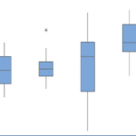 Box Plot: The Five-Number Magic
Box plots are magic boxes that summarize our data using five special numbers, including the middle number or ‘median’, and potential ‘outliers’ or extreme values. The whiskers extend from the box and indicate the variability of the data. Outliers are typically plotted as individual points or asterisks and help identify potential extreme values or anomalies in the dataset. But these boxes can be sneaky! They won’t tell us everything, like exactly how our data is spread out, but they’re great for comparing different groups, like test scores between classes!
Important facts about box plots:
- Box plots show a summary of the distribution, including the median, quartiles, and possible outliers.
- The “box” covers the Interquartile Range (IQR), with a line indicating the median and “whiskers” extending to show the data range.
- They are great for comparing distributions and spotting outliers but don’t provide a detailed view of the distribution shape.
- Box plots don’t provide a detailed view of the distribution shape.
It’s important to remember that box plots alone don’t show the distribution’s shape or density, nor do they show every detail of the distribution.
Violin Plot: The Music of Data
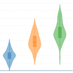 Violin Plot: The Music of Data
A violin plot is like an orchestra playing two instruments together – the box plot and density plot! The ‘violin’ part shows us how our data is spread out, while the ‘box’ part tells us the summary. It allows for easy comparison of distributions between different categories within a dataset. Just be careful, as these can be a bit trickier to read, and just like in the density plot, the ‘smoothness’ of our violin can change the tune!
Important facts about violin plots:
- A violin plot combines a box plot and a density plot.
- The “violin” shape on each side of the box shows the density estimate, providing a better sense of the distribution shape.
- Violin plots give more detailed distribution information than box plots and are especially useful for comparing distributions across categories.
- Violin plots can be more complex to interpret.
The complexity of violin plots can make them less accessible to those unfamiliar with them. Like density plots, the choice of bandwidth for the density estimate can influence the appearance.
Wilkinson Dot Plot: The Dot-to-Dot Game
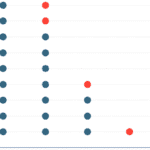 Wilkinson Dot Plot: The Dot-to-Dot Game
Remember the dot-to-dot games? Wilkinson dot plots are a bit like that. Each dot shows a value in our data, which is great because we can see every single data point, like seeing every athlete’s height. This plot allows us to visualize the distribution of data, identify gaps or clusters in the values, and compare the frequency or density of different categories or values. But beware! If the plot has a lot of data, it can become as cluttered as a busy bee hive making it difficult to discern individual dots or accurately estimate their number!
Important facts about pie charts:
- Wilkinson dot plots display individual data points on a single axis, effectively showing the distribution.
- Each dot represents one or more observations, allowing you to see clusters, gaps, and outliers.
- Dot plots show all individual data points, which can be more informative than summary plots like box plots, especially for small datasets.
- They can become cluttered with large datasets.
Watch out if there are many data points, overplotting can be an issue, and it may be difficult to differentiate density.
So, there you have it! Six wonderful chart types tell us all about how data is spread or distributed. Remember, each has its own way of telling the story and its own quirks, but with practice, you’ll be reading them like your favorite book in no time!