When it comes to visualizing data, a box plot and a violin plot are two common ways to show the distribution of the data. They have some similarities but also some differences.
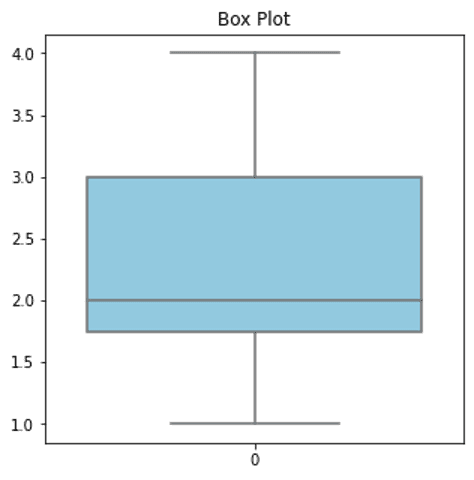
A box plot is a chart that shows the middle 50% of the data using a box. It also shows the minimum and maximum values, as well as any outliers in the data. A box plot is useful for showing how the data is spread out and for identifying outliers.
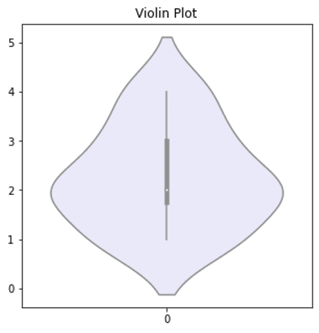
On the other hand, a violin plot is a chart that shows the distribution of the data using a combination of a box plot and a density plot. It shows the same information as a box plot but also shows the shape of the distribution of the data using a density curve.
So, when should you use a violin plot instead of a box plot?
A violin plot can be useful when you want to show the shape of the distribution of the data in addition to the information provided by a box plot. It’s also useful when you have a larger dataset, as it can show more information about the data distribution.
However, a box plot can be useful when you want to focus on the central tendency of the data and the spread of the data. It’s also useful when you want to identify any outliers in the data.
So, while both a box plot and a violin plot can be useful for visualizing data, a violin plot can be a good choice when you want to show the shape of the distribution of the data in addition to other information.