In this article, we’re going to talk about some really cool chart types that display a flow. You’ve probably encountered many of these charts in your daily life while browsing news articles, blog posts, or social media. These charts are great for showcasing the movement of items or information from one state to another or how things are connected. So, let’s dive right in and explore some of these fascinating chart types.
Sankey diagram
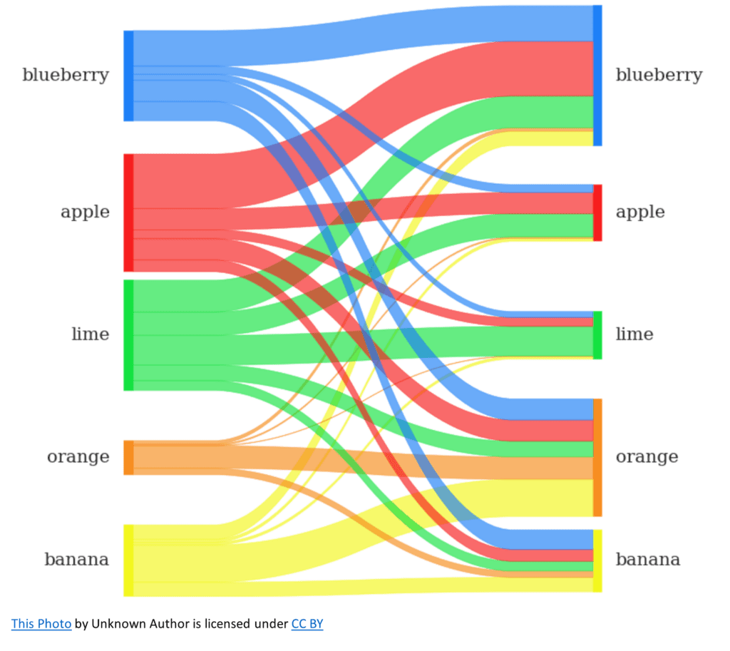
Picture this: You’re reading an article about how fruit is purchased in your local supermarket. You come across a chart showing how someone’s history of ordering particular fruits helps the store predict what you will purchase. This chart is called a Sankey Diagram. It uses thick, colorful arrows to represent the connection between historical and future purchases, and the width of each arrow corresponds to how likely someone is to purchase. The thicker the arrow, the more likely the purchase. Sankey Diagrams are perfect for visualizing how things move through a system or process.
Flow Map
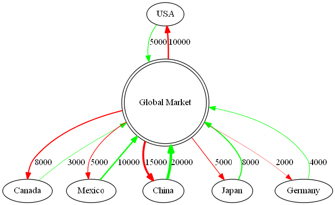
Imagine you’re checking out a blog post about the flow of money between countries. You see a map with curved lines showing the market’s movement from one country to another. This is called a Flow Map. These maps use arrows to represent the direction and quantity of a flow, such as people, goods, or information. The thicker the line, the larger the flow. Flow Maps are great for displaying geographical movement patterns.
Chord diagram
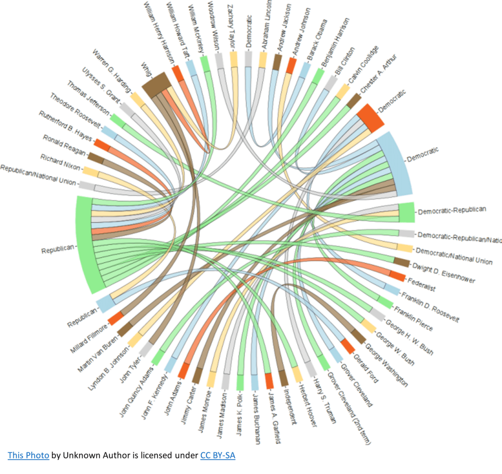
Picture yourself scrolling through social media and coming across an infographic showing former U.S. presidents and their political parties. You see a circular chart with President’s and political parties around the edge and colorful arcs connecting them. This is a Chord Diagram. It elegantly displays the relationships and flows between different entities. The width of each arc represents the size of the flow, making it easy to see which relationships are the most significant.
Tree diagram
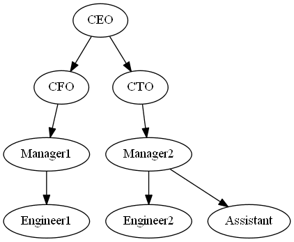
Let’s say you’re reading a news article about a company’s organizational structure. You encounter a diagram with boxes connected by lines, displaying the organization’s hierarchy and flow of information. This is a Tree Diagram. It’s a fantastic way to visualize hierarchical relationships and how information or decisions flow from one level to another.
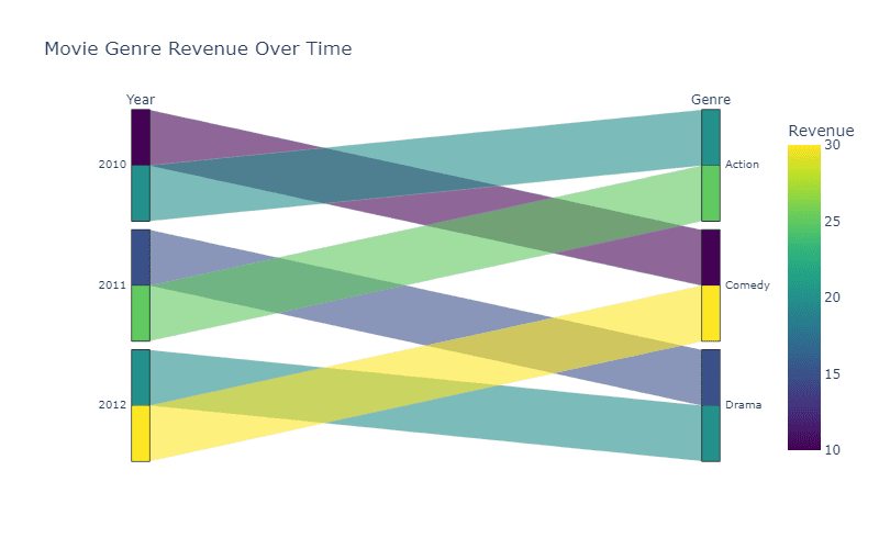
Alluvial diagram
Suppose you’re exploring a blog post discussing the changing popularity of different movie genres. You see a chart with parallel vertical bars representing different years, and the genres are connected with flow lines from one year to another. This is an Alluvial Diagram. It’s perfect for showing how categories change or evolve over time, with the width of each flow line representing the size of the category.
So there you have it! These are just a few of the amazing chart types that display a flow. Next time you encounter these charts in the wild, you’ll better understand how they work and the information they convey.