In this article, we’re going to talk about different chart types that display distribution. These charts are super useful when you want to understand the spread of your data or how the values are distributed across a range. Let’s dive into some common chart types and real-world examples you might come across in everyday life.
Histograms
Imagine you’re scrolling through social media and seeing a post about the ages of people attending a music festival. A histogram is perfect for visualizing this information! It divides the ages into groups (called bins) and shows how many people fall into each group. The higher the bar, the more people in that age range. So, if you see a tall bar for 18-25-year-olds, it means lots of young adults attended the festival.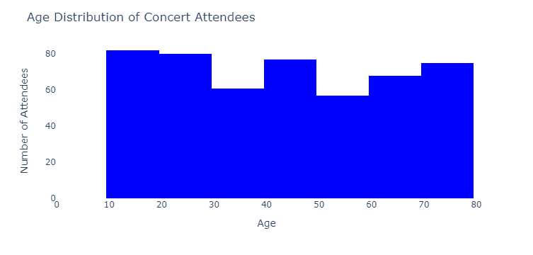
Box Plots
Let’s say you’re reading a blog post comparing the prices of different smartphones. A box plot helps you quickly identify the prices’ median, quartiles, and outliers. The box represents the range between the first and third quartiles (middle 50% of the data), with a line inside showing the median price. Whiskers extend out to the minimum and maximum prices, excluding outliers. If you see a box with a low median and small whiskers, you might think, “Wow, these smartphones are pretty affordable and have similar prices!”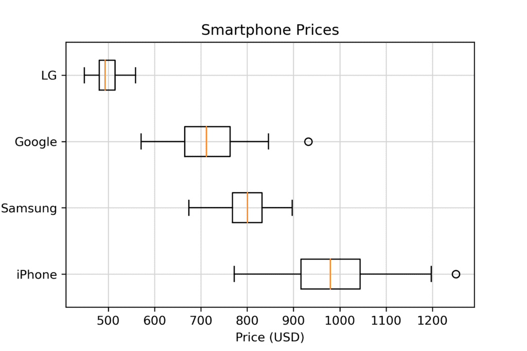
Violin Plots
Imagine a news article discussing how much time people spend on different social media platforms. A violin plot is like a combination of a box plot and a histogram, showing the distribution of the data along with its density. The wider the “violin,” the more people spend that amount of time on a platform. So, if you see a wide violin at 1 hour for one platform and a narrow violin for another, you can quickly tell that more people spend around 1 hour on the first platform than the second.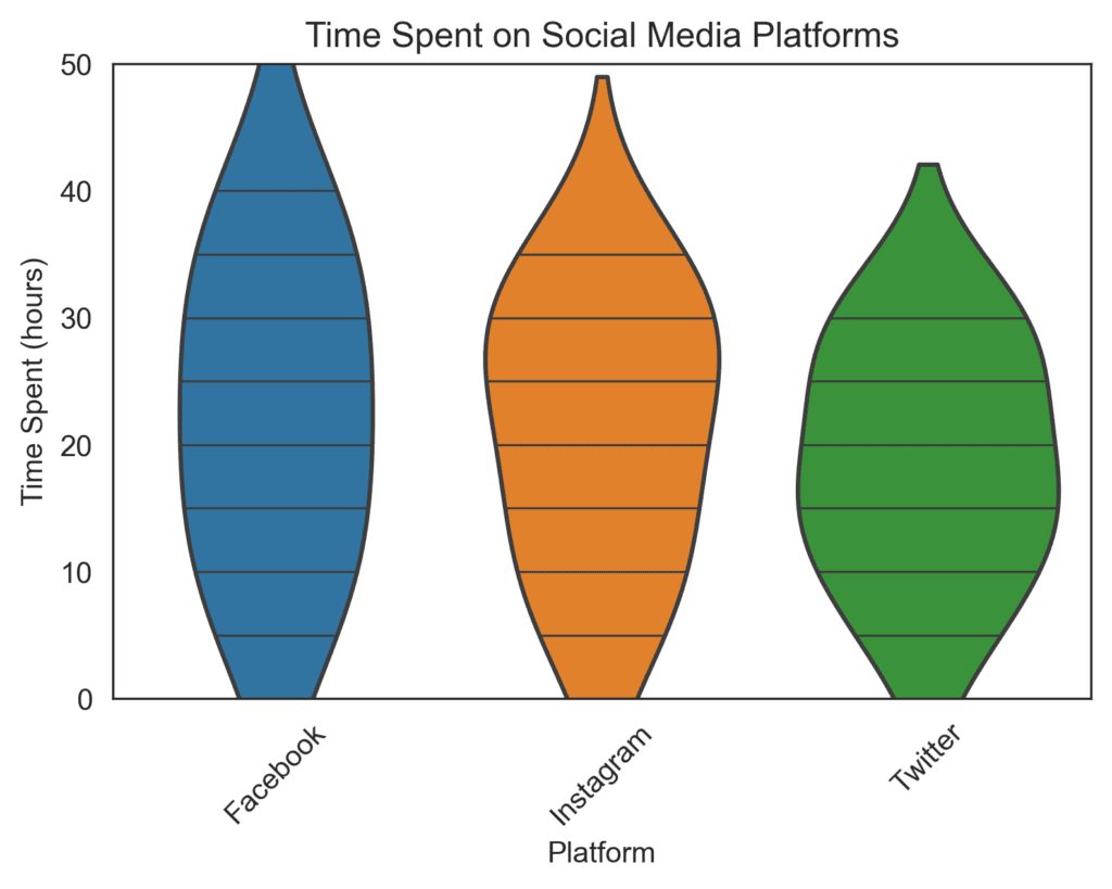
Density Plots
While reading about life expectancy in different countries, you might see a density plot. It’s a smooth curve representing the data distribution, with the area under the curve showing the probability density. The higher the curve, the more common that value is. For example, if you see a high peak at 80 years, it means many countries have life expectancies around that age.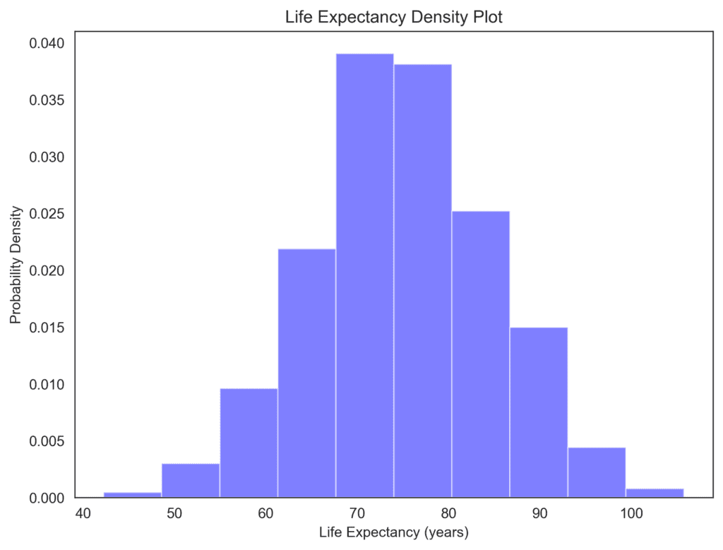
Understanding chart types that display distribution are essential for making sense of the data we encounter in everyday life.