Let’s explore some of the most common spatial data charts and their real-world applications that you might see in the news, blog posts, or social media.
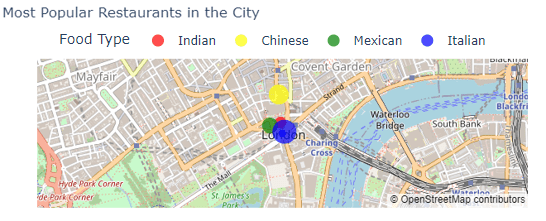
Map with markers
Imagine you’re reading a news article about the best restaurants in London. A map with markers could be used to pinpoint the exact locations of these restaurants, making it easy for you to find them.
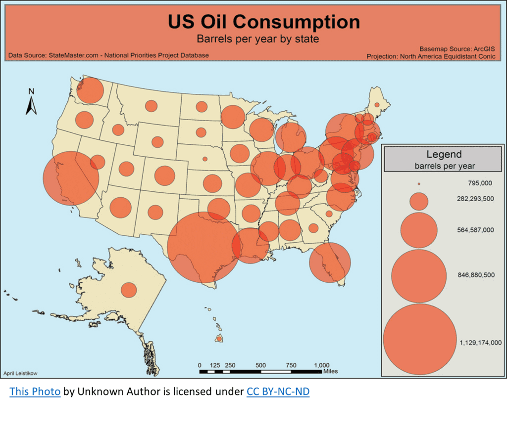
Map with proportional symbols
This type of map shows data by varying the size of symbols at specific locations. For instance, you might see a blog post about oil consumption in different US States. The oil consumption could be represented by circles, with larger circles indicating more consumption.
Want to Learn More About Spatial Data Charts?
If you’d like to improve your data literacy skills, our helpful data literacy training platform can get you up to speed.
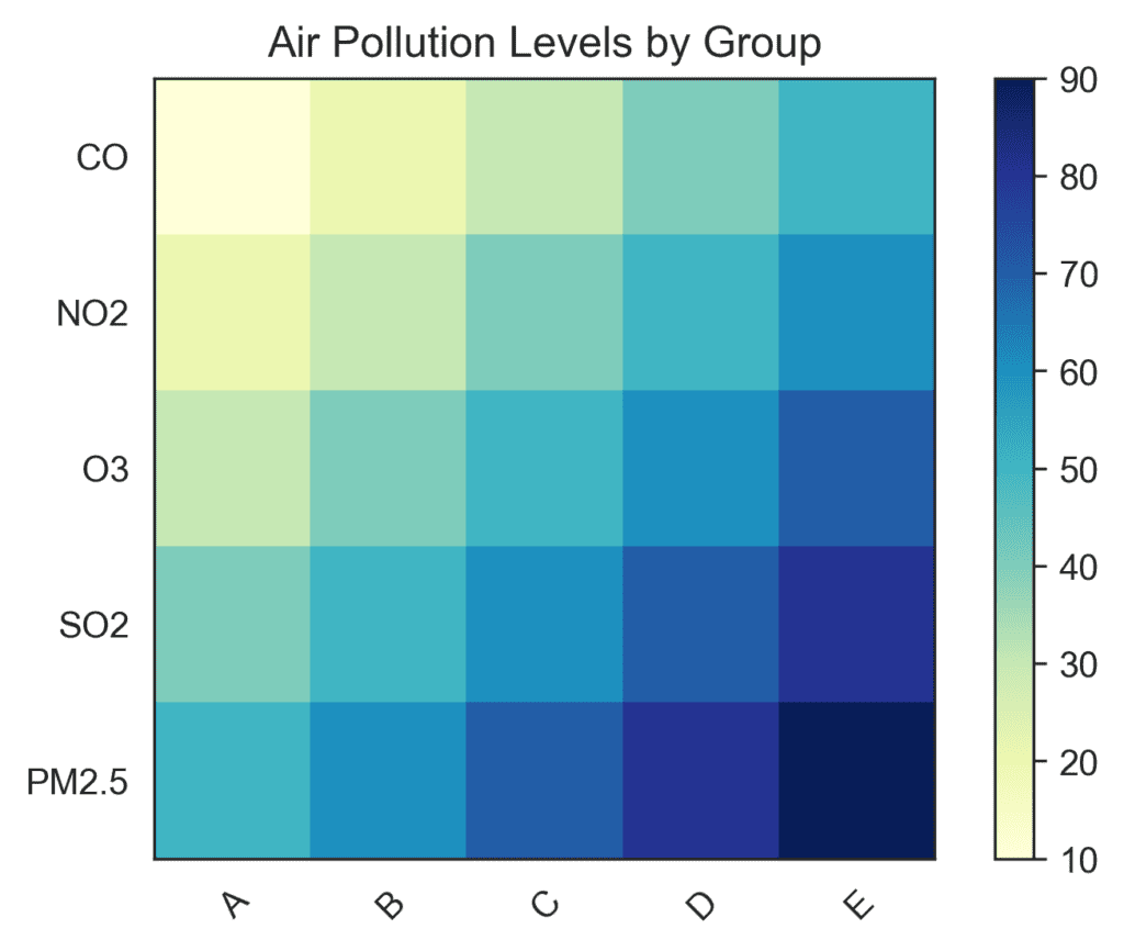
Heatmap
A heatmap uses color intensity to represent data values. Picture a chart showing how different cities are affected by different forms of pollution – darker colors for higher exposure and lighter colors for lower exposure.
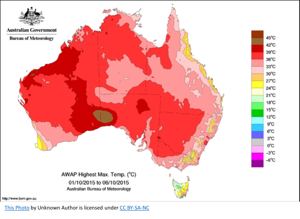
Choropleth
Choropleth maps use color shading to represent data values in specific geographic areas. Let’s say there’s a news article about max temperatures in different areas of Australia. Each area would be shaded with a color that represents its max temperature, allowing you to easily compare regions.
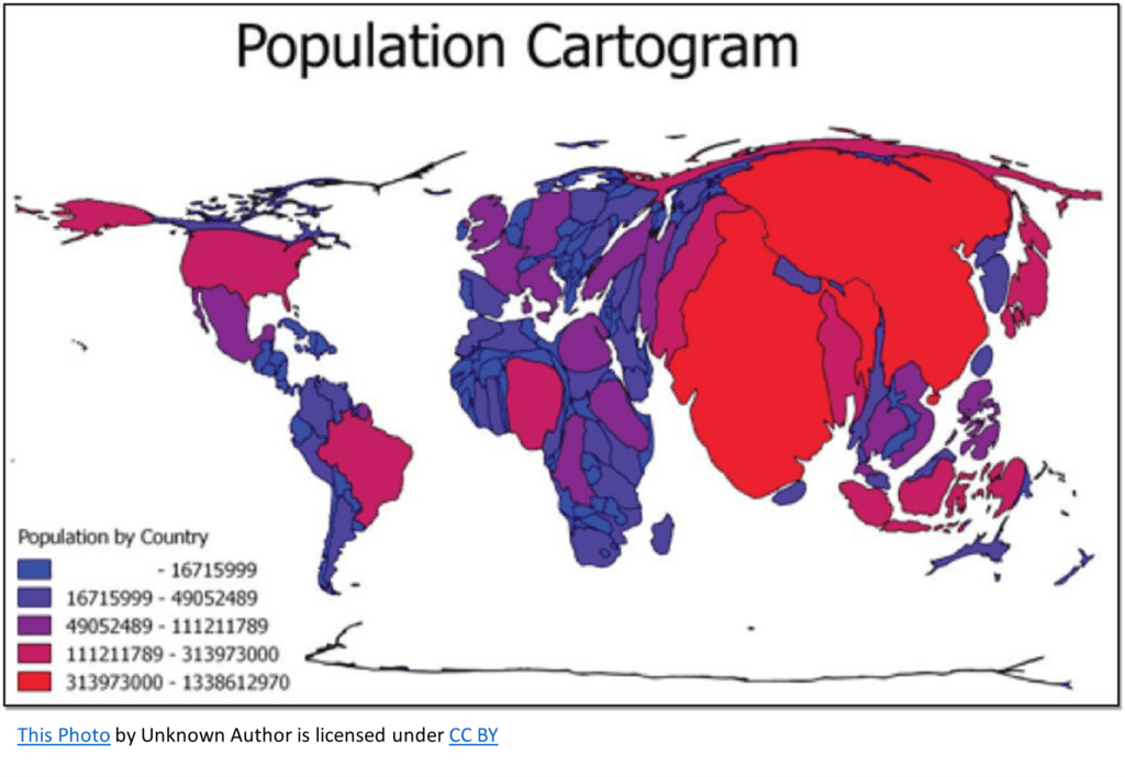
Cartogram
In a cartogram, the size or shape of geographic areas is distorted to represent data values. Imagine a map showing each country’s population- each country’s size would be adjusted based on its population, emphasizing countries with a higher population.
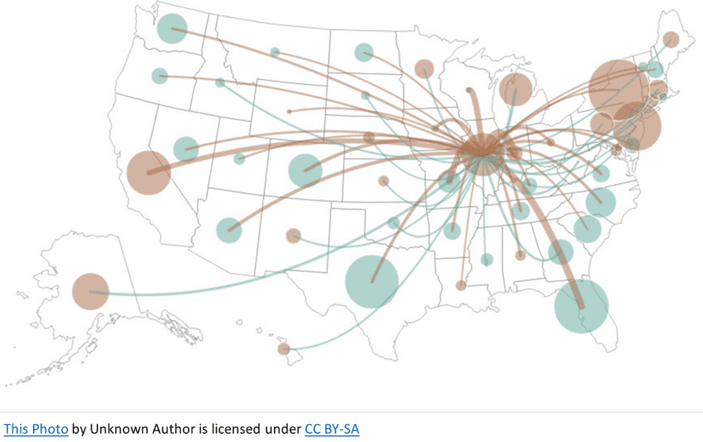
Flow map
Flow maps show movement or connections between locations using lines or arrows. For example, a blog post about migration patterns could use a flow map to show the movement of people from one city to another.
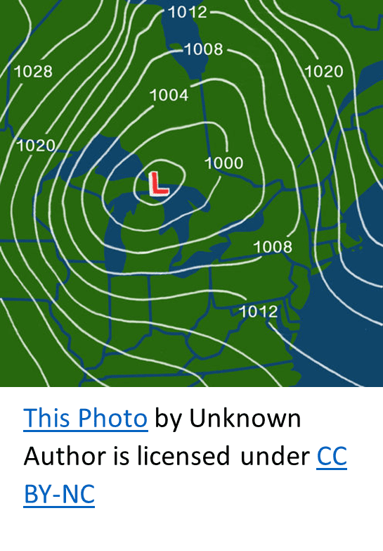
Isopleth
Isopleth maps use lines to connect points with equal data values. Think of a weather map showing pressure contours – lines would connect areas with the same pressure, visually representing weather patterns.
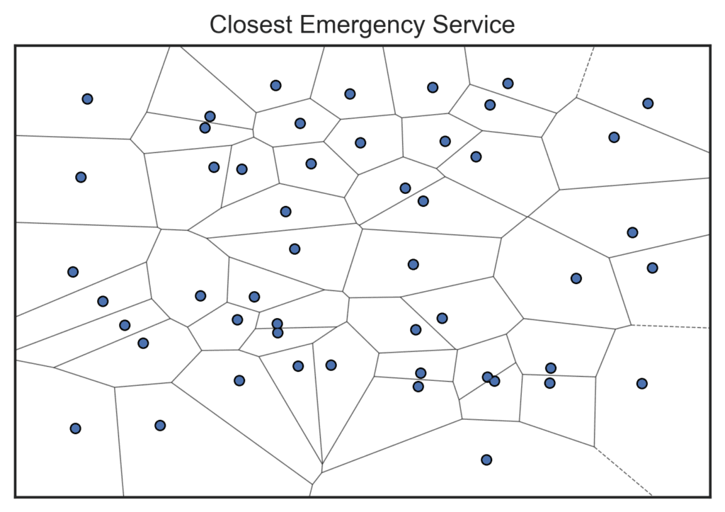
Voronoi diagram
Voronoi diagrams divide a space into regions based on the distance to specific points. Imagine a map of your city with the locations of all emergency services, like hospitals and fire stations. A Voronoi diagram could show you the closest service for any given point in the city.
In conclusion, spatial data charts, also known as maps, are important tools for visualizing and analyzing geographic information. They provide a powerful means of displaying data in a way that allows for easy interpretation and identification of patterns, relationships, and trends.
By using spatial data charts, users can easily identify where specific events or phenomena are occurring and how they are distributed across a geographic region. This is particularly useful for analyzing data related to population, demographics, climate, and natural resources, among other things.