Have you ever wondered why we use charts to explore distributions? It’s because charts help us to visualize and understand how data is spread out. They also allow us to see any patterns or trends in the data.
Now, let’s talk about some common charts that we use to explore univariate distributions. These charts include stem-and-leaf plots, dot plots, box plots, and histograms.
🌱 Stem-and-leaf plot: A stem-and-leaf plot is a way to organize data so that we can see how many times each value appears. The stem represents the first digit or digits of the data, and the leaf represents the last digit. For example, if we have the data set: 15, 25, 25, 30, 35, 40, 40, 45, we can make a stem-and-leaf plot like this:
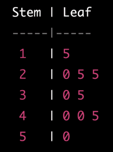
This shows us that there is one 15, two 25s, one 30, one 35, two 40s, and one 45 in the data set.
🔴 Dot plot: A dot plot is a chart that shows the frequency of each value in a data set. It is made by putting a dot above each value for each time it appears. For example, if we have the same data set as before, we can make a dot plot like this:
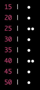
This shows us the same information as the stem-and-leaf plot but in a different format.
📦 Box plot: A box plot is a chart that shows us the distribution of the data. It is made by drawing a box that represents the middle 50% of the data, and lines that represent the rest of the data. The box represents the range from the first quartile (Q1) to the third quartile (Q3), and the line in the box represents the median. The lines outside of the box are called whiskers, and they represent the minimum and maximum values in the data set, excluding any outliers. For example, if we have the data set: 15, 20, 25, 25, 30, 35, 40, 40, 45, 50, we can make a box plot like this:
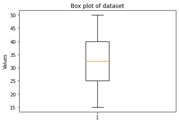
This shows us that the data is evenly distributed, with the median at 32.5.
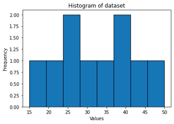
📊 Histogram: A histogram is a chart that shows the frequency of values in a data set by dividing the data into bins and counting the number of values that fall into each bin. The bins are usually represented by bars that touch each other, and the height of each bar represents the frequency of values in that bin. For example, if we have the same data set as before, we can make a histogram like this: