Adapting data storytelling visual narratives for different presentation formats can be both an art and a science. To effectively communicate your insights, it’s essential to tailor your approach based on the design and your audience’s needs. Here are some of the best practices to consider for various presentation formats:
Written format
In a written format, such as a report or article, it’s important to use clear, concise language to describe your data insights. Use simple sentences and focus on the key points. Alongside the written content, visual elements are strategically integrated to enhance the storytelling. Visuals should complement the descriptive text, not replace it, to provide additional context and improve the reader’s understanding of the story. For example, in a report on global warming, you might include a line graph showing the increase in average global temperatures over time and then use text to explain the trends and their implications.
Live presentations
In a live presentation, visuals should be the main focus, as they help to engage the audience and make complex information more accessible. Streamline the language and remove excessive details that may not be relevant or might overwhelm the audience during a live presentation. Use images, charts, and most impactful, informative, or visually appealing graphs to illustrate key points. If using a slideshow, each slide should represent a clear message or story point, with concise text and visually compelling graphics or images. For instance, when discussing unemployment rates, you could show a bar chart comparing the rates for different age groups or a heatmap illustrating regional differences.
Interactive dashboards
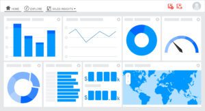
Interactive dashboards are an excellent way to allow your audience to explore data independently. Adapting a visual narrative into a data dashboard involves transforming the narrative’s content and graphic elements into an interactive, user-friendly format. It allows for exploration and analysis of the underlying data. Provide filters and controls that enable users to manipulate the data and view different aspects of it. The data dashboard’s well-defined objectives and purpose ensure the audience has an overview of the data and facilitates specific analysis. Choosing the most suitable data visualizations will effectively represent the insights identified in the visual narrative. For example, in a dashboard about the US elections, you could offer filters for different years, political parties, or demographics and include various visualizations like maps, pie charts, or bar charts to support audience exploration and understanding.
Infographics
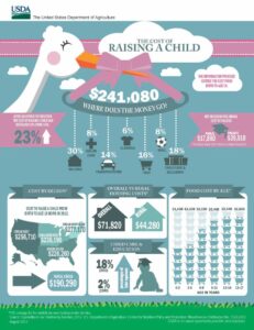
Infographics are a popular way to convey complex information in a visually appealing and easily digestible format. They combine text, images, and data visualizations to tell a story. For example, an infographic about the gender pay gap might include a series of pie charts or bar graphs illustrating the differences in wages between men and women across various industries, along with text describing the key findings and possible solutions.
Social media posts
When sharing data stories on social media, remember that your audience has limited attention spans and may be viewing your content on small screens. Opt for bold, eye-catching visuals that can be quickly understood, and use short captions or headlines to summarize the main points. For example, a post about childhood obesity might feature an engaging chart comparing the prevalence of obesity in different countries, accompanied by a brief headline highlighting the most notable findings.
The key to adapting data storytelling visual narratives for different presentation formats is to consider your audience’s needs and preferences and tailor your approach accordingly.