Designing a visual narrative may require transforming a simple chart into an engaging narrative with a clear setup, conflict, and resolution. These concepts apply to various visualizations, enabling us to create powerful data-driven stories that resonate with our audiences.
Setup
This is where we establish our context and characters for the story. Just as in literature, our characters are the data points, and the context is the chart itself. This might be a bar chart, line graph, or any other visual data representation. We can consider these as the “landscape” where our story unfolds. Introduce the chart and set the context for your story. Clearly explain the data source, the variables represented in the chart, and any relevant background information. Provide the necessary context to help the audience understand the significance of the data and why it matters.
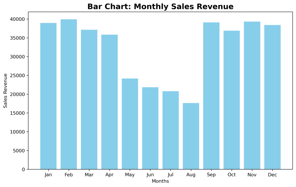
For example, imagine a bar chart showing monthly sales revenue for a small business. The bars themselves represent our characters – the individual data points for each month. The x-axis indicates the different months of the year, while the y-axis represents the revenue in dollars. This is our setup – a snapshot of the company’s sales performance over one year.
Conflict
In any story, challenges and obstacles make the narrative engaging. In a data story, the conflict may arise from patterns, trends, or anomalies that stand out in the chart, highlighting opposing forces, issues, or viewpoints. These elements drive the story’s progression, pique our audience’s interest, and motivate them to explore further. Develop the narrative by analyzing the data and building a storyline that addresses the conflict. Explore the factors contributing to the conflict, the implications of the data, and any relevant insights or patterns that emerge. Use storytelling techniques such as anecdotes, examples, or case studies to provide a deeper understanding of the data and its implications.
Returning to our example, we may notice a significant drop in sales during the summer months. This generates curiosity – what could be causing this dip in revenue? Are customers not buying products because they’re on vacation? Is there an issue with the company’s supply chain during this period? These questions create the conflict that we can address in our data story.
Resolution
This is where we address the conflict by analyzing the data and providing insights to the audience. It’s our opportunity to tie everything together and conclude the story with a meaningful message. To give a clear and satisfying conclusion or outcome to the story you designed, incorporate a summary of key findings, impact or results, lessons learned, and recommendations. The resolution should leave the audience with a clear understanding of the outcomes or implications of the data story.
In the context of our bar chart, we could conduct further analysis to find out why sales dipped during the summer. Perhaps we will discover that the company’s main product is winter clothing, and there’s less demand during the warmer months. In this case, the resolution could be a strategy to diversify the product line and capture sales across all seasons.
So, to summarize, building a story from a chart consists of the following steps:
- Setup: Introduce the context and characters by presenting our chart and its visual components.
- Conflict: Identify patterns, trends, or anomalies that generate interest and pose questions for the audience.
- Resolution: Analyze the conflict, provide insights, and conclude the story with a meaningful message for the audience.