Ensuring that they effectively represent and communicate the underlying data when designing axes for various chart types is essential. Here are some key considerations to keep in mind:
- Choose the appropriate chart type: The first step in designing axes is determining the most suitable chart type for your data. Common chart types include bar charts, line charts, pie charts, and scatter plots. Each chart type is best suited for specific data types, so choosing the right one for your dataset is essential. For example, if you want to show the change in population over time, a line chart would be an ideal choice.
- Establish a clear relationship between axes: The relationship between the x-axis and the y-axis must be easy to understand. For instance, if you’re showing monthly sales data, you might use time on the x-axis and sales figures on the y-axis. Make sure the relationship between both axes is clear so your audience can easily comprehend the data.
- Label your axes: Properly labeling your axes increases the readability of your chart. Clearly indicate what each axis represents and include units of measurement when necessary. For example, if the y-axis represents revenue, you might label it “Revenue (in USD)”.
- Use a suitable scale: The scale you choose for your axes plays a major role in how your data is perceived. For example, using a linear scale for a chart displaying exponential growth can make it challenging to visualize the data correctly. Likewise, a logarithmic scale may not be suitable for data with small variations. So, choose a scale that accurately reflects the data’s behavior and won’t mislead your audience.
- Opt for consistent intervals: When setting up the axes, try to maintain consistent intervals for tick marks and labels, especially when comparing multiple charts. This makes it easier to analyze the data, as the viewer doesn’t have to readjust their perspective when comparing different charts.
- Ensure readability: The readability of your axes is vital. Use legible fonts and avoid cluttering the axis labels. Make sure the tick marks and labels are appropriately sized so they don’t interfere with each other or the data visualization.
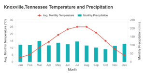
- Consider using dual axes: In cases where two datasets with different units or scales need to be displayed on the same chart, dual axes are an option. A classic example of this is when displaying temperature (in degrees Celsius) and precipitation (in millimetres) on the same chart. Dual axes allow you to visualize both datasets without distorting either by using separate scales; however, ensure that the two axes are clearly distinguished and do not cause confusion.
- Highlight significant points: Sometimes, certain points in your data may be of particular interest. You can use annotations or labels to draw attention to these data points, making it easier for your audience to understand the significance of specific values.