Chart footers provide crucial context and information to your audience, ensuring they correctly interpret and understand your data.
General Guidelines
- Include source information: Always credit the data source, even if it’s your own research or organization. This increases your credibility and allows your audience to dig deeper if they wish.
- Add a timestamp: Help your audience understand when the data was collected or when the chart was created. This is especially important for time-sensitive data.
- Use clear and concise labels: Choose short yet descriptive phrases for chart elements, such as axes titles and legend items. This makes it easier for your audience to grasp the presented information.
- Keep it minimal: A cluttered footer can leave your audience overwhelmed. Stick to the essential information, and ensure a clean and organized layout.
- Maintain consistency: Ensure the footer’s formatting and styling align with the chart’s overall visual design. Maintain font sizes, colors, and alignment to create a seamless look.
- Accessibility: Design your footer to be easy to read for everyone, considering factors such as font size, color contrast, and text hierarchy.
- Test and iterate: As with any design work, test your chart footer with a few people from your target audience to check if it’s working as intended. Take feedback and iterate as needed.
Relevant Information
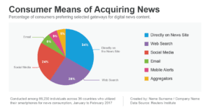
- Total Counts When Displaying Percentages: When your chart shows percentages or proportions, try to include the total counts or overall sum. This gives your audience the context to understand the full size of the represented data set. For example, if you’re displaying a pie chart that shows the percentage of people who prefer different flavors of ice cream, the footer should include the total number of ice cream lovers surveyed.
- Sample Size: If your data is based on a sample rather than a population, mention the sample size in your footer. This provides your audience with information about the reliability and representativeness of your data, which can impact their decision-making. Suppose you’re presenting a bar chart on a study about the most effective weight-loss workout routines. In that case, the footer should include something like “Sample size: n=300 participants.”
- Sources: Crediting your data sources adds transparency and reflects the reliability of your data visualization. If you’ve used multiple sources or the data comes from a study/publication, include those details in the footer. For instance, if you’ve prepared a line chart showing the global temperature trend over the years, the source could be stated as: “Data source: NASA Global Land-Ocean Temperature Index.”
- Author: Including the author’s name or organization responsible for creating the chart helps your audience identify who has prepared the visualization and can lend credibility to your work. For example, if you’re presenting a scatterplot to showcase the correlation between income and education levels, you could include “Created by: [Your Name/Organization]” in the footer.
By including the appropriate information in your chart’s footer (total counts, sample size, sources, and author), you help facilitate better understanding and trust in your work.