When it comes to visualizing data, histograms and density plots are two ways to show the distribution of the data. They have some similarities but also some differences. Here’s a quick rundown on density plots vs histograms.
What Does a Histogram Show?
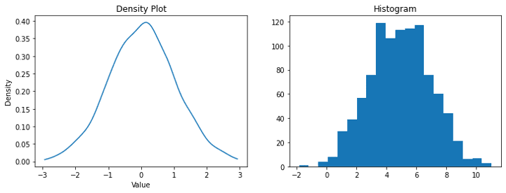
A histogram is a chart that shows how many times each value appears in a dataset using bars. The bars are grouped into bins, which represent a range of values. The height of each bar represents the frequency of values in that bin, or how many times a value appears in that range.
What Does a Density Plot Show?
On the other hand, a density plot is a smooth curve that shows the distribution of the data. The curve represents the proportion of the data in each range rather than the frequency. This means that the height of the curve doesn’t show how many times a value appears but rather the proportion of the data that falls into that range.
In simple terms, a histogram shows the counts of values in each range, while a density plot shows the proportion of values in each range. While a histogram is made up of bars that touch each other, a density plot is a smooth curve that shows the distribution of the data in a more continuous way.
So, both histograms and density plots are helpful for visualizing the distribution of data, but they show slightly different things. Histograms show counts, and density plots show proportions, but both can be useful for understanding patterns in the data.
Upskill Your Data Literacy Knowledge
Upskill Your Knowledge with QuantHub Data Literacy Certificates: Certificates for K-12
Upskill Your Knowledge with QuantHub Data Science Certificates: Certificates for Professionals