What Is a Correlation Heatmap?
A correlation heatmap is a graphical tool that displays the correlation between multiple variables as a color-coded matrix. It’s like a color chart 🌈 that shows us how closely related different variables are.
In a correlation heatmap, each variable is represented by a row and a column, and the cells show the correlation between them. The color of each cell represents the strength and direction of the correlation, with darker colors indicating stronger correlations.
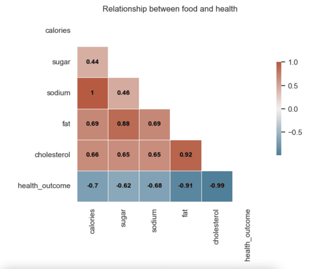
📈 For example, if we’re studying the relationship between the type of food we eat and our health, a correlation heatmap might show how closely related different types of food are to different health outcomes, such as heart disease or diabetes.
How to Read a Correlation Heatmap?
In this section, we will delve into how to read a correlation heatmap, an effective visual tool for discerning the strength and direction of relationships between variables:
- Look at the color of each cell to see the strength and direction of the correlation.
- Darker colors indicate stronger correlations, while lighter colors indicate weaker correlations.
- Positive correlations (when one variable increases, the other variable tends to increase) are usually represented by warm colors, such as red or orange.
- Negative correlations (when one variable increases, the other variable tends to decrease) are usually represented by cool colors, such as blue or green.
📊 Understanding correlation heatmaps can help us identify patterns and relationships between multiple variables. So next time you analyze data with many variables, think like an artist and use a correlation heatmap to see the colors of the relationships! 🧐🎨