Hey, guys! Today, we’re talking about heatmaps and how to read them. 📈
How Do You Read a Heatmap?
A heatmap is a graphical representation of data where the values in a matrix are represented as colors. 🔥 The darker the color, the higher the value, and the lighter the color, the lower the value. To read a heatmap, you need to look at the colors and see where the darker areas are. 🧐
How Do You Interpret Variable Associations in a Heatmap?
A heatmap is great for exploring relationships between multiple variables. 🔍 The cells in the heatmap show the strength of the association between two variables. If the cells are dark, then there is a strong association between the two variables. If the cells are light, then there is a weak association. 📊
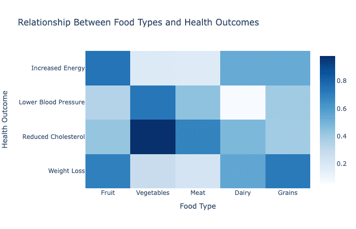
- For example, let’s say you’re looking at a heatmap that shows the relationship between types of food and health outcomes. 🥗🏥 If the cells for “fruits and vegetables” and “low blood pressure” are dark, then there is a strong association between eating fruits and vegetables and having low blood pressure. On the other hand, if the cells for “fast food” and “low blood pressure” are light, then there is a weak association between eating fast food and having low blood pressure. 🍔🏥
So there you have it, guys! To read a heatmap, look at the colors and see where the darker areas are. To interpret variable associations, look at the cells and see how dark or light they are. 🔍🧐🔥🤓