Hey, friends! Today, we’re talking about line charts and how they can be used to explore associations between variables. 📈
So, what are the benefits of using a line chart to explore the association between variables? 🤔
Line charts are easy to interpret and are good for exploring continuous variables with few discrete points. They show the relationship between two variables by connecting data points with a line. Line charts are useful for identifying trends and patterns in the data over time. 🔍
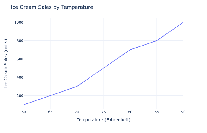
For example, let’s say you’re looking at a line chart that shows the relationship between temperature and ice cream sales. The line plot can show how ice cream sales increase as temperature increases. 🍦🌡
A line chart is best used when you want to summarize averages of one variable broken down by a second variable. The second variable is usually a categorical variable, and the line chart shows the average value of the first variable for each category of the second variable. 📊
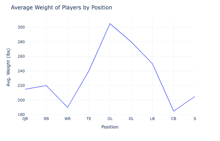
For example, let’s say you’re looking at a line chart that shows the average weight of football players broken down by position. The line chart can show how the average weight of players varies by position, with offensive and defensive linemen having the highest average weights. 🏈
When looking at a line chart, you should look for positive or negative changes in the averages, as well as overall trends. A positive change means that the average value is increasing, while a negative change means that the average value is decreasing. The overall trend shows the direction of the change over the entire range of the chart. 🔍
For example, let’s say you’re looking at a line chart that shows the average salary for different jobs over time. You should look for positive or negative changes in the average salary for each job, as well as the overall trend of the change over time. 📈💰

So there you have it, friends! Line charts are easy to interpret and good for exploring continuous variables with few discrete points. Line charts are useful for summarizing averages of one variable broken down by a second variable. When looking at a line chart, you should look for positive or negative changes in the averages and overall trends. 🤓📊🔍