What Is a Parallel Coordinates Plot?
A parallel coordinates plot is a graphical tool used to visualize the relationship between multiple variables. It’s like a musical score 🎼 where each variable represents a different instrument, and the lines show how they play together.
In a parallel coordinates plot, each variable is represented by a vertical axis, and the data points are connected by lines that run parallel to each axis. The lines represent the observations, and the way they cross the axes shows the relationship between the variables.
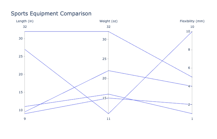
📈 Parallel coordinates plots are most helpful when exploring correlation across many variables, especially when there are a small number of observations. For example, if you’re studying the characteristics of different types of sports equipment, you might use a parallel coordinates plot to compare the length, weight, and flexibility of different types of equipment.
The lines in a parallel coordinates plot represent the observations in the data set. Each line connects the values of each variable for a single observation. The position of the line along each axis shows the value of the variable for that observation.
👉 If the line is close to the top of the axis, that means the variable has a high value for that observation. 👉 If the line is close to the bottom of the axis, that means the variable has a low value for that observation.
Having all the variables on the same scale in a parallel coordinates plot makes it easier to compare them. This is because we don’t have to worry about the scale of each variable being different. Instead, we can focus on the position of the lines and how they relate to each other.
📊 Understanding parallel coordinates plots can help us identify patterns and relationships between multiple variables. So next time you’re analyzing data with multiple variables, think like a composer and use a parallel coordinates plot to explore them! 🧐🎵